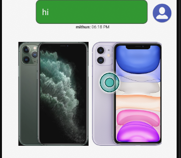
PreChat Survey/ Rich Content Engine
Nuance Messaging SDK allows Applications to display a Survey before starting an engagement. Surveys can be used to collect basic customer informations that are then send to agent/VA.This way agents will know their customer in the begining of the engagement.
A Survey can direct Customer to the right Business unit he/she wants to engage with.
Rich Content Widget.
Rich Content widgets are displayed in the messaging window during an engagement as an inline message or within a chat bubble.
- Overview
- Creating Native automaton configuration
- Code a Node
- Adding a form control to the node
- Heading Properties
- Paragraph Properties
- Input Properties
- Select Properties
- CheckBox Properties
- Radio Properties
- Button Properties
- ListGroup Properties
- Card Properties
- CardDeck Properties
- Configuring Form Control Visibility and Enable State
- Creating Guard Condtion
- Configuring Transitions
- Styling Form Controls
Prechat Survey supports following features.
Survey results are send to agent as datapass.
Prechat Engine can route the engagement to different AG and BU upon survey submission.
Surveys can be configured to check the agent availability post submission before starting the engagement.
SDK let surveys to be displayed in more than one pages.
Setting up PreChat Survey
Application should pass guideIDas the key and value in the engage parameter Hash Map.
guideID as the key and value must be id that is configured in nuance database for the prechat JSON.
Rich Content features.
Rich content widget can interact with customers during an active engagement.
Widget can collect information which can then send to VA or agent during an engagement.
Setting up Rich Content Widgets
Rich content widget JSON payload can be send from Agent Interface as well as from VA.
Application must add nuanpreview.aar as a dependecy for Rich Widget engine to display Images.
Use below bool properties to enable and configure the rich media features.
| Name | type | default | description |
|---|---|---|---|
| showAvatarForRichWidget | bool | <bool name="showAvatarForRichWidget">false</bool> | Use this property to turn on avatar for inline widget view |
Creating a Native Survey/Rich content configuration.
Following sections explains how to create a prechat survey/Rich content JSON configuration. This document also lists the styling classes exposed by the SDK.
JSON configuration which is fetched from nuance servers has limited styling elements , SDK allows application to customize the look and feel of these widgets.
Base Configuration Properties.
Following properties are the building blocks of Automaton configuration JSON.
| widgetType | Type of the Rich widget. Supported values are quickreply or card or form or carosel or receipt Default is form Dependes upon the value SDK chooses different layout container |
| widgetView | Rich Widget rendering mode. Supported values are bubble or inline or popup Setting to bubble make the SDK render Rich Widget inside an agent message bubble. widgetType does not have any effect when widgetView is bubble.  |
| widgetAction | Customer action to the Rich Widget. Supported values are optional or mandatory Setting optional lets customer to do other things like typing in the bottom Input box and allows to click send button in the messaging window |
| nodes | Nodes is an array contains one or more node. Each node represents a page in the PreChat Survey. |
| transitions | Transitions contains one or more transition. Each transition handles logical transition of customer from one page(node) to another(node), sending Rich Message data etc |
| initialState | Set the initial node that is displayed to the user |
Styles Exposed By SDK for widget Inline Container.
| quickreply | 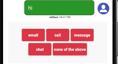 |
<style name="InlineQuickContainerDefault.quickContainer"></style> |
| card | 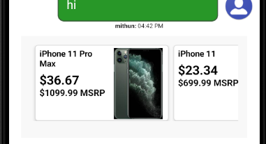 |
<style name="InlineCardContainerDefault.cardContainer"></style> |
| form | 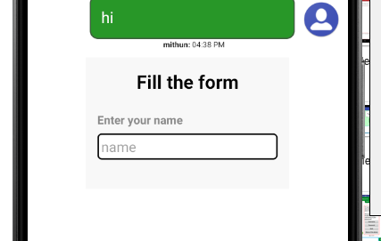 |
<style name="InlineFormContainerDefault.formWidgetContainer"></style> |
| carosel | <style name="InlineCaroselContainerDefault.caroselContainer"></style> | |
| receipt | <style name="InlineReceiptContainerDefault.receiptWidgetContainer"></style> |
    {
	  "widgetType": "form",
	  "widgetView": "bubble",
	  "widgetAction": "optional",
	  "nodes": [],
	  "transitions":[],
	  "initialState":"view1"
	}
Creating a Node (page).
A node represents a page in the survey. A node contains one or more form elements for collecting Customer information or to guide customer to the right business unit.
Following properties must be set in every nodes.
| id | Node Id. |
| controls | An object describing the form elements displayed in this node. Each form control in this node is assigned to an indexed property of this object. Index number starts with 0 and increments for every new form element. |
    {
	   "widgetType": "form",
	  "widgetView": "bubble",
	  "widgetAction": "optional",
	  "constants": [],
	  "nodes": [{
    "id": "view1",
    "controls": {
      "0": {
        },
	  "1": {
	    }
	  }
	  }],
	  "transitions":[],
	  "initialState":"view1"
	}
Adding a form control to the node.
A form Control Object witin a node describes an element that is displayed to the user.
A form control can optionally have a label control.
Form control you wish to display must be assigned to an indexed property of parent control object.
There are three parts to the Form Control JSON object , ie Control Properties, Validation Properties,Events Supported
Control Properties: Control properties are used to define the behaviour of the control.
Validation Properties: Validation properties specifies the validation that will be performed on the user provided input during the form submission.
Each validation property is a JSON object with following fields.
| required | value: true or false | error: message that is displayed to user if it doesn't pass this validation |
| minlength | length: integer value | error: message that is displayed to user if it doesn't pass this validation |
| maxlength | length: integer value | error: message that is displayed to user if it doesn't pass this validation |
| pattern | value: regex string for pattern matching | error: message that is displayed to user if it doesn't pass this validation |
Events: Events define events that the form control fires upon a user action.
| name | name of the event |
| when | Optional, only required when event is other than form-control default |
Event property is a JSON object with the fields.name and optionally a when
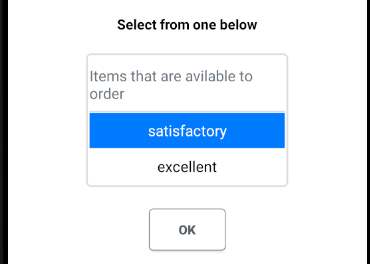
Heading Properties
| type | type of the form control. Heading |
| text | Heading text that is displayed in the heading. |
| level | Supported values are 1 to 6 |
| context | Sets an object with style properties |
    {
	 	"widgetType": "form",
	  	"widgetView": "bubble",
	  	"widgetAction": "optional",
	  	"nodes": [{
    "id": "view1",
    "controls": {
      "0": {
            "type": "Heading",
        	"level": "5",
       		"text": "Select from one below"
        }
	  }
	  }],
	  "transitions":[],
	  "initialState":"view1"
	}
Style Properties
Below style properties are avilable within json spec.
| background | Set background color | |
| border | set border color | |
| textAlign | set text alignment left|center|right |
|
| text | set text color | |
| textStyle | set heading style normal|italic|bold (not recomended as heading has intrincic style) |
|
| textSize | set heading size (not recomended as heading has intrincic size) | |
| Example | "context": { "text":"#ff0000", "background":"#D3D3D3" "border":"#808080" "}" | 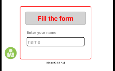 |
Style Exposed for Application Developers
<style name="GuideHeadingDefault.GuideHeading"></style>
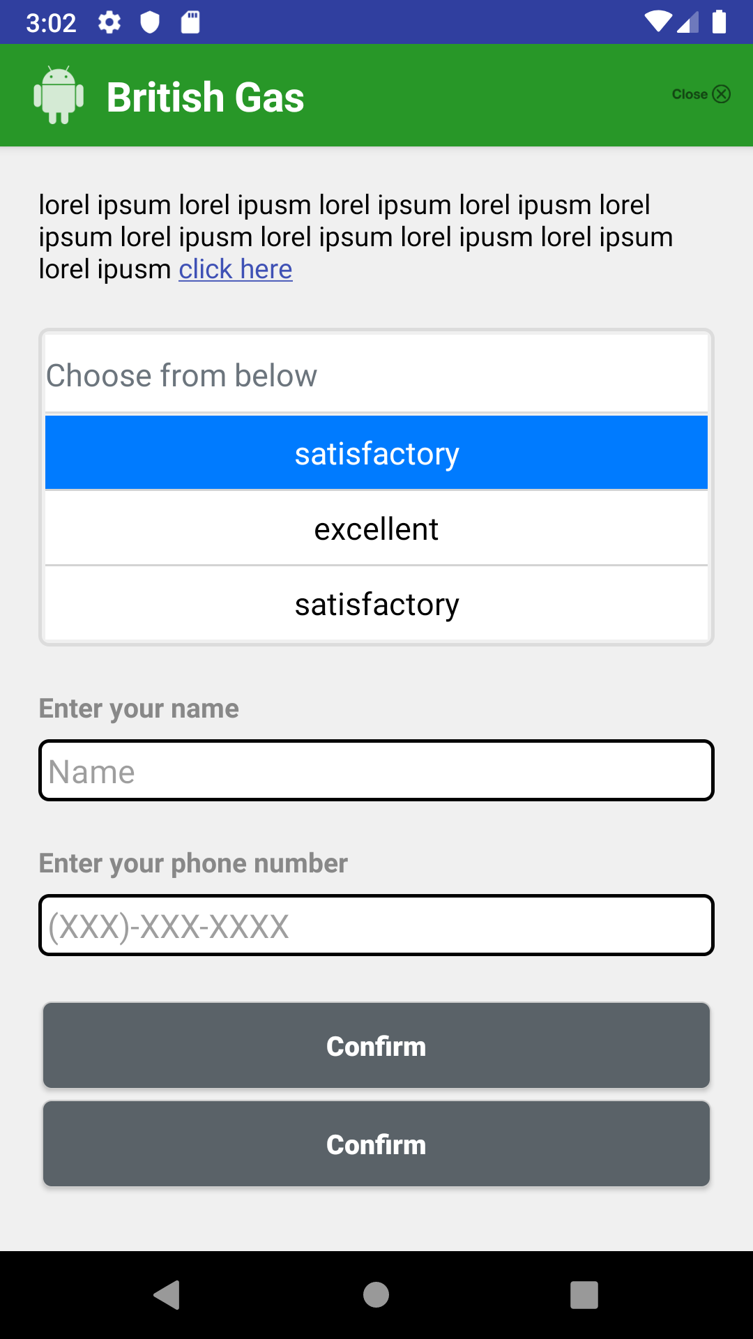
Paragraph Properties
| type | type of the form control. Paragraph |
| text | Heading text that is displayed in the heading. |
| context | Sets an object with style properties |
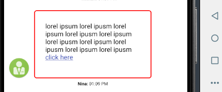
    {
	 	"widgetType": "form",
	  	"widgetView": "bubble",
	  	"widgetAction": "optional",
	  	"nodes": [{
    "id": "view1",
    "controls": {
      "0": {
            "type": "Paragraph",
       		"text": "lorel ipsum lorel ipusm lorel ipsum lorel ipusm lorel ipsum lorel ipusm lorel ipsum lorel ipusm lorel ipsum lorel ipusm click here"
        }
	  }
	  }],
	  "transitions":[],
	  "initialState":"view1"
	}
Style Properties
Below style properties are avilable within json spec.
| background | Set background color |
| border | set border color |
| text | set text color |
| textStyle | set paragraph style normal|italic|bold |
| textSize | set paragraph size |
Style Exposed for Application Developers
<style name="GuideParagraphDefault.GuideParagraph"></style>
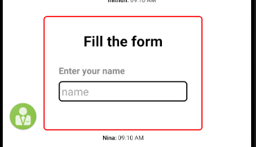
Input
Input Properties
| type | type of the form control. Input |
| id | Id of this form control. |
| placeholder | Set the input place holder value. |
| label | Set the optional label for this element. |
| helpText | helper tooltip appear below the input. |
| actionType | Set the input type. date,number, email,phone,text |
| context | Sets an object with style properties |
| validation | Json object describing the input validation properties.
"validation": { } |
| event | Json object describing the events fired upon a user action. Default fired event is onTextChange Other Events are onEnterKeyPressed and onFocusOut "event": { "name": "EventOne"} |
Input Validation Properties
Validation properties can optionally set an error text which will be diplayed to the user if validation fails.
Following are the validation properties that are supported by Input control.
| required | Is input value is manditory for submitting the form "required": {} |
| minlength | Set the minimum length allowed for the provided input. |
| maxlength | Set the maximum length allowed for the provided input. |
| pattern | Set the regex pattern that is validated against the input. |
    {
    	"widgetType": "form",
	  "widgetView": "bubble",
	  "widgetAction": "optional",
	  "nodes": [{
    "id": "view1",
    "form-controls": {
      "0": {
			  "label": "Please type your name:",
			  "id": "customerName",
			  "type":"Input",
			  "placeholder": "enter your name",
				"validation": {
				"required": {
				  "value": true,
				  "error": "Name is required"
				},
				"minlength": {
				  "length": 5,
				  "error": "should be minimium 5 chars"
				},
				"maxlength": {
				  "length": 30,
				  "error": "should not be more than 30 chars"
				},
				"pattern": {
				  "value": "\\w+([\\.-]?\\w+)*@\\w+([\\.-]?\\w+)*(\\.\\w{2,3})+",
				  "error": "not a valid email address"
				}
			  },
			  "event": {
				"name": "EventOne"
			  }

           },
	  "1": {
	    }
	  }
	  }],
	  "transitions":[],
	  "initialState":"view1"
	}
Style Properties
Below style properties are avilable within json spec.
| background | Set background color |
| border | set border color |
| text | set label color |
| textAlign | set label alignment left|center|right |
| textStyle | set label style normal|italic|bold |
| textSize | set label size |
Style Exposed for Application Developers
	<style name="GuideLabelDefault.GuideLabel"></style>

    <style name="GuideEditTextDefault.GuideEditText"></style>
    <style name="GuideErrorDefault.GuideError"></style>
    <style name="GuideHelperDefault.GuideHelper"></style>
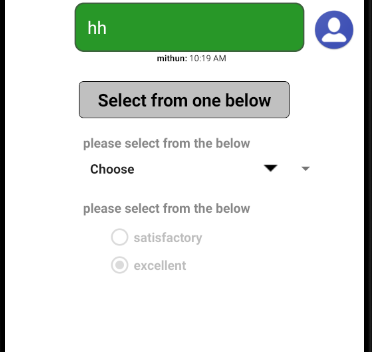
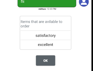
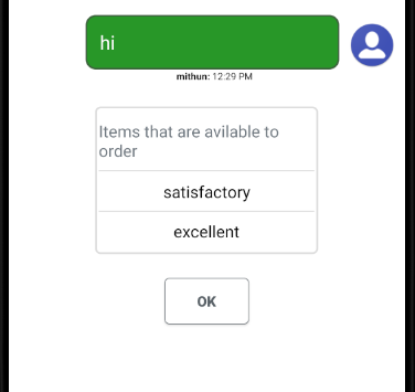
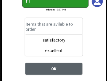
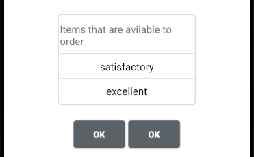
Select Properties
| type | type of the form control. Select |
| id | Id of this form control. |
| items | An array of strings that will displayed to user upon clicking on it. |
| label | Set the optional label for this element. |
| values | An array of strings that will used as value for the item in the items array. |
| selectedIndex | Default selected item from the items array. |
| header | First item will be a header which doesn't have any selected index. |
| helpText | helper tooltip appear below the input. |
| event | Json object describing the events fired upon a user action. Default event is onItemSelected "event": { "name": "EventTwo"} |
| context | Sets an object with style properties |
Select Validation Properties
| required | Set if check box selection is manditory. "required": {} |
    {
	 "widgetType": "form",
	  	"widgetView": "bubble",
	  	"widgetAction": "optional",
	  "nodes": [{
    "id": "view1",
    "controls":

	  "0": {
			"label": "Please select from following services",
        	"type": "Select",
            "id": "services",
            "items": [
              "wireless",
              "internet",
              "digital"
            ],
            "event": {
              "name": "EventSeven"
            }
	    }
	  }
	  ],
	  "transitions":[],
	  "initialState":"view1"
	}
Style Properties
Below style properties are avilable within json spec.
| background | Set background color |
| border | set border color |
| text | set label color |
| textAlign | set label alignment left|center|right |
| textStyle | set label style normal|italic|bold |
| textSize | set label size |
Style Exposed for Application Developers
	<style name="GuideLabelDefault.GuideLabel"></style>

    <style name="GuideSpinnerDefault.GuideSpinnerView"></style>
     <style name="GuideErrorDefault.GuideError"></style>
    <style name="GuideHelperDefault.GuideHelper"></style>
CheckBox Properties
| type | type of the form control. CheckBox |
| id | Id of this form control. |
| label | Set the optional label for this element. |
| items | An array of strings that will displayed along with check box control. |
| values | An array of strings that will used as value for the item in the items array. |
| helpText | helper tooltip appear below the input. |
| event | Json object describing the events fired upon a user action. Default event is onItemChecked "event": { "name": "EventTwo", } |
| validation | Json object describing the input validation properties.
"validation": { } |
| context | Sets an object with style properties |
CheckBox Validation Properties
Validation properties can optionally set an error text which will be diplayed to the user if validation fails.
Following are the validation properties that are supported by CheckBox control.
| required | Set if check box selection is manditory. "required": {} |
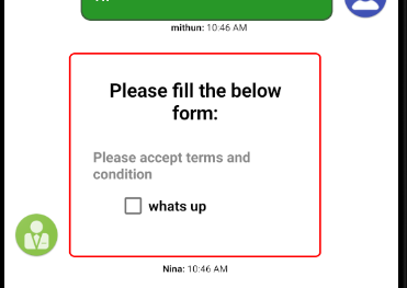
    {
	 "widgetType": "form",
	  	"widgetView": "bubble",
	  	"widgetAction": "optional",
	  "nodes": [{
    "id": "view1",
    "controls": {
      "0": {
		  	"type":"Heading",
            "text": "Please fill the below form:",
          	"level":3
        },
	  "1": {

          	"type":"CheckBox",
            "id": "terms",
            "label": "Please accept terms and condition",
            "items": ["whats up"],
            "validation": {
              "required": {
                "value": true
              }
            }
            "event": {
              "name": "EventFive"
            }

	    }
	  }
	  }],
	  "transitions":[],
	  "initialState":"view1"
	}
Style Properties
Below style properties are avilable within json spec.
| background | Set background color |
| border | set border color |
| text | set label color |
| textAlign | set label alignment left|center|right |
| textStyle | set label style normal|italic|bold |
| textSize | set label size |
Style Exposed for Application Developers
	<style name="GuideLabelDefault.GuideLabel"></style>

    <style name="GuideCheckboxContainerDefault.GuideCheckboxContainer"></style>
    <style name="GuideCheckboxItemDefault.GuideCheckBox"></style>
      <style name="GuideErrorDefault.GuideError"></style>
    <style name="GuideHelperDefault.GuideHelper"></style>
Radio Properties
| type | type of the form control. RadioButton |
| id | Id of this form control. |
| label | Set the optional label for this element. |
| options | An array of items that will be part of this radio group. |
| values | An array of strings that will used as value for the item in the options array. |
| selectedIndex | Default selected item from the options array. |
| helpText | helper tooltip appear below the input. |
| event | Json object describing the events fired upon a user action. Default event is onOptionChanged "event": { "name": "EventTwo"}. |
| validation | Json object describing the input validation properties.
"validation": { } |
| context | Sets an object with style properties |
Radio Validation Properties
Validation properties can optionally set an error text which will be diplayed to the user if validation fails.
Following are the validation properties that are supported by Radio control.
| required | Set if radio selection is manditory. "required": {} |
    {
	 "widgetType": "form",
	  	"widgetView": "bubble",
	  	"widgetAction": "optional",
	  "nodes": [{
    "id": "view1",
    "form-controls": {
       "0": {
		  	"type":"Heading",
            "text": "Please fill the below form:"
          	"level":3
        },
	  "1": {
	  		 "type":"RadioButton",
			"label": "please select your gender",
            "id": "gender",
            "options": [
              "male",
              "female"
            ],
            "selectedIndex": 0,
            "event": {
              "name": "EventSix"
            }
	    }
	  }
	  }],
	  "transitions":[],
	  "initialState":"view1"
	}
Style Properties
Below style properties are avilable within json spec.
| background | Set background color |
| border | set border color |
| text | set label color |
| textAlign | set label alignment left|center|right |
| textStyle | set label style normal|italic|bold |
| textSize | set label size |
Style Exposed for Application Developers
	<style name="GuideLabelDefault.GuideLabel"></style>

<style name="GuideRadioGroupDefault.GuideRadioGroup"></style>
    <style name="GuideRadioButtonDefault.GuideRadioButton"></style>
      <style name="GuideErrorDefault.GuideError"></style>
    <style name="GuideHelperDefault.GuideHelper"></style>
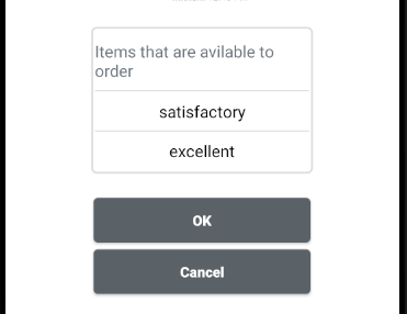
Button Properties
Array of Button controls in the same node index is rendered horizontally.| type | type of the form control. Button |
| id | Id of this form control. |
| text | text displayed on the button control. |
| actionType | Set the type of the button. submit: Default button state is to submit the form. reset: Button for clearing the form. cancel: Button for cancelling the current form. end: Button for ending the guide, Used while rendering prechat Survey |
| event | Json object describing the events fired upon a user action. Default event is onClick "event": { "name": "EventTwo"}. |
    {
	 {
	 "widgetType": "form",
	  	"widgetView": "bubble",
	  	"widgetAction": "optional",
	  "nodes": [{
    "id": "view1",
    "controls": {

	  "0": [
			{
		    "type":"Button"
            "id": "cancelBtn",
            "text": "cancel",
            "type": "cancel",
            "event": {
              "name": "EventEight"
            }
          },
            {
              "type":"Button"
              "id": "submitBtn",
              "text": "Start Chat",
              "type": "submit",
              "event": {
                "name": "EventNine"
              }
            }
          ]
	  }
	  }],
	  "transitions":[],
	  "initialState":"view1"
	}
Style Properties
Below style properties are avilable within json spec.
| style | Supported value are outline or block or outline-block "style": "outline" |
  |
| context | Supported Context are primary or secondary or success or danger or warning or info or light or dark or link | 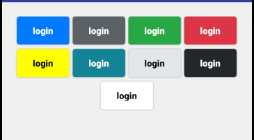 |
| size | Supported values are small or large Default is small |
|
| align | left,right,center(default) Lets you postion the inline style button relative to parent container, default value is center. |
Style Exposed for Application Developers
<style name="GuideButtonDefault.GuideButtonView"></style>
Two inline button side by side
Two block button side by side
QuickReply Button
| type | type of the form control. QuickReplyButton |
| id | Id of this form control. |
| text | Array of text elements. |
| values | Array of values that is associated with each element. |
| event | Json object describing the events fired upon a user action. Default event is onClick "event": { "name": "EventTwo"}. |
| align | left,right,center(default) Lets you postion the inline style button relative to parent container, default value is center. |
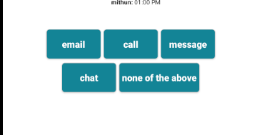
    {

	 "widgetType": "form",
	  	"widgetView": "bubble",
	  	"widgetAction": "optional",
	  "nodes": [{
    "id": "view1",
    "controls": {

	  "0": {
	        "type":"QuickReplyButton",
            "id": "cancelBtn",
             "text": [
                       "email",
                        "call",
                        "message",
                        "chat",
                        "none of the above"
                        ],
            "event": {
              "name": "EventEight"
            }
	    }
	  }
	  }],
	  "transitions":[],
	  "initialState":"view1"
	}
ListGroup Properties
| type | type of the form control. ListGroup |
| id | Id of this form control. |
| items | Array of strings displayed as list items. |
| header | Text that is displayed as header |
| event | Json object describing the events fired upon a user action. Default eventis onItemSelected "event": { "name": "EventTwo"} |
    {
	  "widgetType": "form",
	  	"widgetView": "bubble",
	  	"widgetAction": "optional",
	  "nodes": [{
    "id": "view1",
    "controls": {
	  "0": {
	  		  "type": "ListGroup",
			  "id": "listitem",
			  "items": ["test","test1","test2"],
			  "event": {
				"name": "EventOne"
			  }

	    }
	  }
	  }],
	  "transitions":[],
	  "initialState":"view1"
	}
Style Exposed for Application Developers
    <style name="GuideListHeaderDefault.GuideListHeader"></style>
    <style name="GuideListItemDefault.GuideListItem"></style>
ListSelectableGroup properties
| type | type of the form control. ListSelectableGroup |
| id | Id of this form control. |
| items | Array of strings displayed as list items. |
| header | Text that is displayed as header |
| event | Json object describing the events fired upon a user action. Default eventis onItemSelected "event": { "name": "EventTwo"} |
Style Exposed for Application Developers
    <style name="GuideListHeaderDefault.GuideListHeader"></style>
    <style name="GuideListItemDefault.GuideListItem"></style>

       <color name="guidelistitemBackground">#FFFFFF</color>
    <color name="guidelistitemTextColor">#000000</color>
    <color name="guidelistitemSelectedBackground">#007bff</color>
    <color name="guidelistitemSelectedTextColor">#FFFFFF</color>
Image Properties
| type | type of the form control. Image |
| id | Id of this form control. |
| src | Array of image urls. |
| size | set width and height of the image |
| layout | vertical or horizontal Default value is vertical |
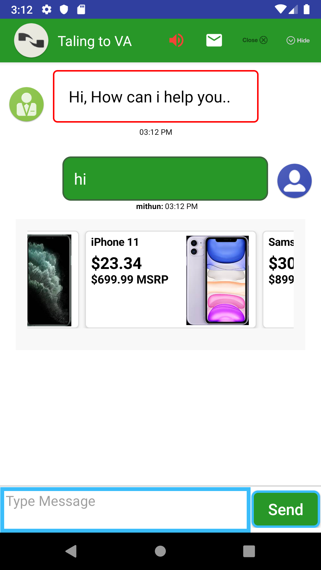
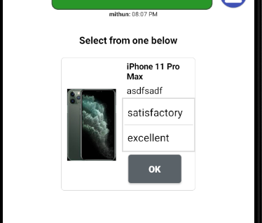
Card Properties
| type | type of the form control. Card |
| id | Id of this form control. |
| cardTitle | Optional card title text. |
| cardSubTitle | Optional card subtitle text |
| cardText | Optional card subtitle text |
| cardImage | Optional card image that gets displayed either top, left or as overlay |
| cardButtons | Optional buttons that gets displayed in the card footer |
| listGroup | Optional listgroup that gets displayed in the card body |
| header | Optional text that gets displayed in the header area, Displaying header will hide card_image |
| size | Use this property to set the width of the card |
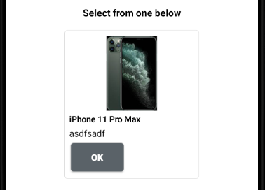
    {
	  "widgetType": "form",
	  	"widgetView": "bubble",
	  	"widgetAction": "optional",
	  "nodes": [{
    "id": "view1",
    "controls": {
	  "0": {
	  		  "type": "Card",
			  "id": "card",
			  "cardSubTitle": "iPhone 11 Pro Max",
			  "cardText": "asdfsadf",
			   "cardImage": {
                        "src": "https://www.att.com/catalog/en/idse/Apple/Apple%20iPhone%2011%20Pro%20Max/Midnight%20Green-hero.png",
                        "position": "top"
                        },
                        cardButtons":["
                        {
                        "type": "Button",
                        "id": "button1",
                      	"context": "secondary",
                        "text":"OK",
                        "enable":{
                        "trigger":"eventinputchange",
                        "guard":"(#widget1.list1.selectedIndex>-1)"
                        }
                        }],
			  "event": {
				"name": "EventOne"
			  }

	    }
	  }
	  }],
	  "transitions":[],
	  "initialState":"view1"
	}
Horizontal card view
Header card view
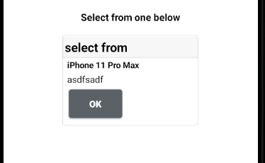
List card view
Style Properties
Below style properties are avilable within json spec.
| cardBorder | card border color |
| bottomSeperator | sperator between card buttons and body |
| headerBackground | header background color |
| header | header text color |
| color | card backround color |
| title | title color |
| subTitle | title color |
| text | body text color |
CardDeck Properties
| type | type of the form control. CardDeck |
| id | Id of this form control. |
| cards | Array of cards. |
Configuring Form Control Visibility and Enable State
Automaton engine provides a way to configure the visibility and Enabled/Disabled state of the form-control.
Engine changes the form control state dynamicaly when a give condition matches.
How it works?
Form control can listen to events fired by other control in the same node. All the other form controls in the same node gets triggered upon matching the event name fired by the other control.
Once triggered, form control evaluate the Guard condition provided in JSON configuration. Refer the section Creating Guard Condition.
| visible | JSON object for form control to control the visibility state. |
| enabled | JSON object for form control to control the enabled/disabled state. |
					{
					  "automaton.name": "BBPreChatGuide",
					  "automaton.id": "12344",
					  "automaton.type": "survey",
					  "constants": [],
					  "nodes": [{
					"node.name": "view1",
					"form-controls": {
					  "0": {
						  "label": "please select your gender",
						  "radio": {
							"id": "gender",
							"options": [
							  "male",
							  "female"
							],
							"selected-index": 0,
							"event": {
							  "name": "EventSix",
							  "when": "onOptionChanged"
							}
						  }
						},
					  "1": {
												 "label": "Please accept terms and condition",
							  "checkbox": {
								"id": "terms",
								"items": ["whats up","sfas df as"],
								"validation": {
								  "required": {
									"value": true
								  }
								},
								"default-error": "terms and condtion is missing",
								"visible": {
								  "trigger": "EventSix",
								  "guard": "(#view2.gender.selectedIndex == 1)"
								},
								"event": {
								  "name": "EventFive",
								  "when": "onItemChecked"
								}
							  }
						}
					  }
					  }],
					  "transitions":[],
					  "initialState":"view1"
					}
Creating Guard Condtion
Automaton engine has a built in condition parser and evaluator.
Rules for creating a condition:Supported Comparison Operators: == , != , > , >= , < , <= , !
Supported Logical Operators: && , ||
Supported in built functions: is_empty
All the operands of logical operators must by parenthesized.
Guard condition must full be parenthesized.
Operands which fetches a form control values or constant value or dynamic variable value must start with #.
Form Control Properties for Condition expressions
| text | Returns the text value of input control. |
| selectedIndex | Returns selected item index of Radio,Select,List control. |
| selectedText | Returns selected item text of Radio,Select,List control. |
| item | Returns checked state of CheckBox control. |
| checkedItemsText | Returns a comma separated text of all CheckBox control checked items. |
Examples
(!(isEmpty(#view1.customerName.text)))
(#view2.terms.item.0.isChecked == true)
(#view2.terms.item.1.isChecked == true)
(#view2.gender.selectedText)
(!(is_empty(#view1.customerName.text))) && (#view2.terms.item.0.isChecked == true)
(#view4.services.selectedIndex == 1)
Configuring Transitions
Transitions in the JSON configuration takes care of navigating the user from one node to another.
Transition engine listens to events fired by the form controls, Upon receiving an event engine looks for a match. All the transition listening to that event gets triggered.
In addition to navigating , transitions also can fire start engage event. Which will transition the UI from Automaton to Messaging screen.
Transition Properties
| name | name of this transition |
| from | name of the node that this transition object will navigate the user from. |
| to | This property can be as simple as a node name or an object with complex transition logic. |
| trigger | Name of the event that triggers this transition. |
Configuring To Property
to transition property can be as simple as a node name to which user should be navigate to or can be an object with complex condition.
Examples {
"name": "TransitionOne",
"from": "view1",
"to": "view2",
"trigger": "EventOne"
}
to object support below property.
| guard | name of this transition |
			{
	"name": "TransitionOne",
	"from": "view1",
	"to": {
		"guard": {
		}
	},
	"trigger": "EventOne"
}
guard accepts single aswell as an array of objects
Automaton engine executes the condition provided in the guard object. If there is more than one gaurd object, automaton engines executes each one of them till a condition becomes true.
| condition | condition expression that Automaton engine will parse and execute |
| onTrue | You can set a node name to which user should be navigated if condition turns true. Or you can set a JSON object which triggers an engage event. |
| onFalse | You can set a node name to which user should be navigated if condition turns false. |
			{
	"name": "TransitionOne",
	"from": "view1",
	"to": {
		"guard": {
			"condition": "(!(is_empty(#view1.customerName.text))) && (#view2.terms.item.0.isChecked == true)",
            "onTrue": "view3"
		}
	},
	"trigger": "EventOne"
}
Configuring Engage event transition (Prechat Survey)
You can configure the engine to transition to Messaing upon meeting a condition specified in the onTrue property of guard object.
			{
	"name": "TransitionOne",
	"from": "view1",
	"to": {
	"guard": {
		"condition": "(!(is_empty(#view1.customerName.text))) && (#view2.terms.item.0.isChecked == true)",
			"onTrue": {
				"engage": {
				}
			}
		}
	},
	"trigger": "EventOne"
}
| type | Type of the engagement. chat,call |
| checkAgent | If this property present, engine checks for agent availability. |
| data | Use this property to override the engage paramenters. |
| datapass | Use this property to configure datapass information to agent. |
Configuring checkAgent Property
| isNotHop | Provide the node that gets displayed to user if messaging service is not in the Hours of Operation. |
| buzy | Provide the node that gets displayed if agent is buzy. |
| offline | Provide the node that gets displayed if agent is offline. |
					{
					 	"widgetType": "survey",
					  "constants": [],
					  "nodes": [{
					"id": "view1",
					"controls": {
					  "0": {
					   		"type":radio",
						  	"label": "please select your gender",
							"id": "gender",
							"options": [
							  "male",
							  "female"
							],
							"selectedIndex": 0,
							"event": {
							  "name": "EventSix"
							}

						},
					  "1": {
					  			"type":"checkbox",
								"label": "Please accept terms and condition",
								"id": "terms",
								"items": ["whats up","sfas df as"],
								"validation": {
								  "required": {
									"value": true,
									"error":"Terms should be accepted"
								  }
								},
								"visible": {
								  "trigger": "EventSix",
								  "guard": "(#view2.gender.selectedIndex == 1)"
								},
								"event": {
								  "name": "EventFive"
								}

						}
					  }
					  }],
					  "transitions":[{
    "name": "TransitionOne",
    "from": "view1",
    "to": "view2",
    "trigger": "EventOne"
  },{
      "name": "TransitionTwo",
      "from": "view2",
      "trigger": "EventTwo",
      "to": {
        "guard": [{
          "condition": "(!(isEmpty(#view1.customerName.text))) && (#view2.terms.item.0.isChecked == true)",
          "onTrue": {
            "engage": {
              "type": "chat",
              "checkAgent":{
                "isNotHop":"view4",
                "buzy":"view4",
                "offline":"view4"
              },
              "data": {
                "openerText": "hi from view 2",
                "agID":"10004026",
                "buID":"13000508"
              },
              "datapass": {
                "customerName":"#view1.customerName.text",
                "DOB":"#view2.dob.text",
                "gender":"#view2.gender.selectedText",
                "service":"#view2.services.selectedText",
                "checkedItems":"#view2.terms.checkedItemsText"
              }
            }
          }
        },
          {
            "condition": "(!(isEmpty(#view1.customerName.text))) && (#view2.terms.item.1.isChecked == true)",
            "onTrue": "view4",
            "onFalse": {
              "error": "Please fill date of birth field."
            }
          }
        ]
      }
    }],
					  "initialState":"view1"
					}
Configuring DataMessage Transitions (Rich Widget)
You can configure the engine to send a data message to VA or agent once user action is completed for Rich content widget
sendMessage property can be added as a property of to object or as a property of onTrue object
Value of displayText property is displayed in the transcript area after user has completed his action
			{
               "name": "TransitionOne",
               "from": "widget1",
               "to": {
               "sendMessage": {
               		"customerName":"#view1.customerName.text",
	                "displayText":"hello"
	                }
                },
                "trigger": "eventClicked"
            }
Styling Form Controls Container
You can use the following style classes to style controls
	//Prechat Container
	<style name="GuideContainerDefault.GuideContainer"></style>
	//control container
	<style name="GuideItemContainerDefault.GuideItemContainer"></style>
        //Widget container
        <style name="GuideItemContainerDefault.GuideItemContainer"></style>
        //Label
        <style  name="GuideLabelDefault.GuideLabel"></style>
        //Input
        <style name="GuideEditTextDefault.GuideEditText"></style>
        //Heading
        <style name="GuideHeadingDefault.GuideHeading"></style>
        //Button
        <style name="GuideButtonDefault.GuideButtonView"></style>
        //Radiogroup
        <style name="GuideRadioGroupDefault.GuideRadioGroup"></style>
        //RadioButton
        <style name="GuideRadioButtonDefault.GuideRadioButton"></style>
        //Vertical radio button
        <style name="GuideRadioButtonVerticalDefault.GuideRadioButtonVertical"></style>
        //CheckBox
        <style name="GuideCheckboxContainerDefault.GuideCheckboxContainer"></style>
        //Checkbox item
        <style name="GuideCheckboxItemDefault.GuideCheckBox"></style>
        //Error
        <style name="GuideErrorDefault.GuideError"></style>
        //Helper text
        <style name="GuideHelperDefault.GuideHelper"></style>
        //Select
        <style name="GuideSpinnerDefault.GuideSpinnerView"></style>
        //List header
        <style name="GuideListHeaderDefault.GuideListHeader"></style>
        //List item
        <style name="GuideListItemDefault.GuideListItem"></style>