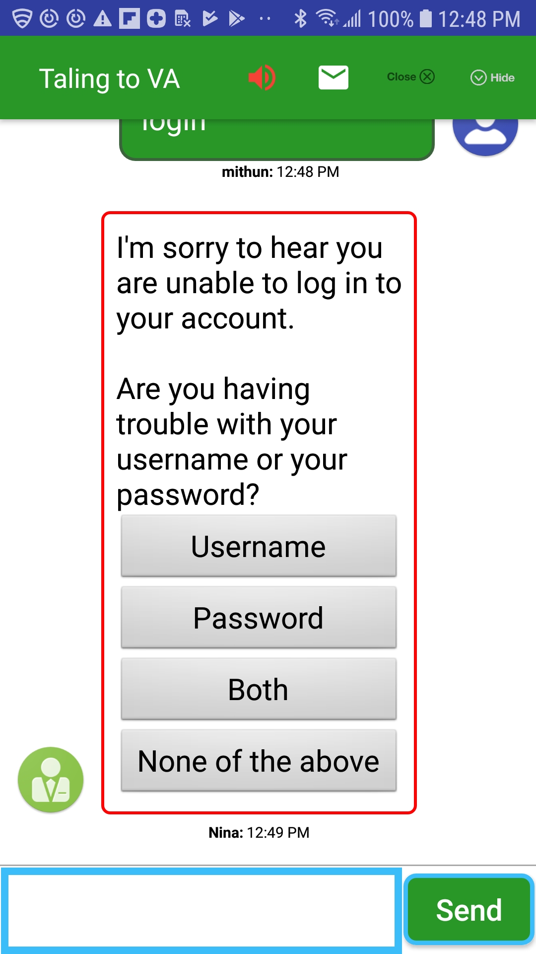
NuanceMessagingActivity
NuanceMessagingActivity is an Android Activity component which implements a messaging UI. SDK exposes styling properties which allows you to customize the look and feel of the Messaging UI. NuanceMessagingActivity uses all the SDK Api's described in the previous session of this document to create an engagement with the agent.
- Launching Activity
- Using Plain Bubble View
- Using Arrow In Bubble View
- Using Speech Bubble View
- Styling Send Button
- Styling customerTextInput
- Styling Plain or Arrow Bubble View
- Styling Speech Bubble View
- Styling Activity Layout
- Styling Email Dialog
- App String Properties
- Customizing Title Bar
- Agent Message When Minimized
- Displaying Customer/Agent Name in bubbles.
- Displaying Progress Dialog.
- Displaying Timestamp log.
- Displaying Backpress Confirmation.
- Displaying PostChat Confirmation Dialog.
- Configuring Virtual Agent message to display Natively
- Styling File Upload fragment.
- Displaying User Input Limit Counter.
- Content hugging
- Displaying disclaimer header
- Displaying Link preview.
- RTL (Right To Left) mode.
- Hidden messages
- Toggle visibility of minimize button
Methods to launch and configure NuanceMessagingActivity is exposed from NuanMessaging class.
public void launchBrandedMessaging(Context context, HashMap<String,String> engageParams, HashMap<String,String> agentAttributes, HashMap<String,String> datapass);
Context: Current context object
engageParams:Engage parameters needed to create an engagement.It must be an instance of HashMap with following keys.
| siteID | SiteID parameter is mandatory to create an engagement. |
| buID | Mandatory Business Unit ID to check agent availability and HOP availability. |
| agID | Mandatory AgentGroupID which is required for a new engagement. |
| brID | Mandatory Business rule ID is used to tie this engagement to a business rule for reporting purposes |
| openerText | Opener message that will be added to transcript upon agent assign. |
| opID | ID of the Opener message that is configure is portal. |
| brName | BusinessRuleName parameter is optional. |
| autoID | Associated automation ID with this engagement request. |
| pageID | Page Marker ID where an engagement starts. |
| priority | Initial engagement priority of the engagement request. A higher number indicates a higher priority in the queue |
| qmSpecID | The ID of the queue messaging spec as identified in TouchPortal. If the queue messaging spec is valid, it will pull the proper queue message and display it as message text when the API caller calls the Get message API call. |
| qt | Queue threshold value for engagement. Used to calculate whether this engagement goes into the queue in cases where agent slots are not available. |
| scriptID | ID of the agent’s scripts for this engagement. |
| isAsyncEngagement | Set the value to true if this is an asyncronus engagement. |
| asyncMode | "all" or "none". Setting "all" lets user to view all previous conversations. |
| asyncDays | Set the days for which async conversation is fetched |
| customerName | Value of this parameter will be displayed in the customer bubble. Refer "Displaying Customer/Agent name in bubbles" section of this page. |
| autoDataPass | Use this field to pass automaton Datapass. Please use setNinaVars method in NuanMessaging Class |
| emailSpecID | Allow application to pass an email spec ID which is used to control the chat transcript email settings |
| automatonDataMap | Allow application to pass an automatonDataMap | >
agentAttributes: List of agent attributes used in routing process. Format: attribute1,value1;attribute2,value2 etc.
dataPass: Data pass attributes in name and value pairs.
public void launchBrandedMessaging(Context context, int flag, HashMap<String,String> engageParams, HashMap<String,String> agentAttributes, HashMap<String,String> datapass)
flag: Set Activity Launch Intent flags.
Below Function lets you restore the minimized Messaging Activity
public void restoreBrandedMessaging(Context context)
public void restoreBrandedMessaging(Context context, int flag)
flag: Set Activity Launch Intent flags.
Below Function lets you check the state of the chat.
public Boolean isChatInProgress
Pass an instance of WindowStateListener to receive callbacks when user minimizes, closes chat window, on an Agent assigned, when an engagement created, when an engagement ended, when a conversation is resolved or on various error states
public void setOnWindowStateListener(WindowStateListener listener)
Pass an instance of NinaTransitionListener to receive callbacks when Nina VA does a handoff to application to display Application screens.
public void registerNinaTransitionListener(NinaTransitionListener listener)
Below functions lets you pass fcmToken outside of SDK initialize method. FCM Token must be provide before user starts an engagement.
public void setFcmToken(String fcmToken)
Use the setNinaVars function to pass nina vars which will be send to VA during each GetMessage API request. Passing true to the reset param causes the given nina vars gets cleared after sending to VA
public void setNinaVars(HashMap
Below Function to set the SDK timeout for an active engagement.Engagement can be timed due to application being in background
public void setEngagementTimeoutInSeconds(int timeoutInSeconds)
Below Function allows you to override the SDK set API URL
public void overrideAPIDomain(String apiUrl)
Below Function allows you to override the SDK set Auth URL
public void overrideAuthDomain(String authUrl)
Below Function allows application to inject string resource values during the application run time.
public void setResources(Map
resources: maps of key and value pairs, each key and value will override the same string resource in string.xml .
Configuring the Assisted Event Settings
| Name | type | default | example |
|---|---|---|---|
| assisted_agent_message_count | Integer | 2 | <integer name="assisted_agent_message_count">2</integergt; |
| assisted_customer_message_count | Integer | 2 | <integer name="assisted_customer_message_count">2</integer> |
Configuring the PostChatSurvey eligiblity settings
| Name | type | default | example |
|---|---|---|---|
| survey_fire_agent_count | Integer | 3 | <integer name="survey_fire_agent_count">3</integergt; |
| survey_fire_customer_count | Integer | 1 | <integer name="survey_fire_customer_count">1</integer> |
Toggle opener message in asynchronous mode when a previous chat is already present.
| Name | type | default | example |
|---|---|---|---|
| displayOpenerTextInAsync | Boolean | true | <bool name="displayOpenerTextInAsync">true </bool> |
Set cancelable for the activity indicator displayed while loading the chat history
| Name | type | default | example |
|---|---|---|---|
| cancelLoaderOnRestore | Boolean | true | <bool name="cancelLoaderOnRestore">true </bool> |
Plain Bubble View in Converstation Screen
Plain bubble Converstation View along with an Icon for agent is the default view of NuanceMessagingActivity.
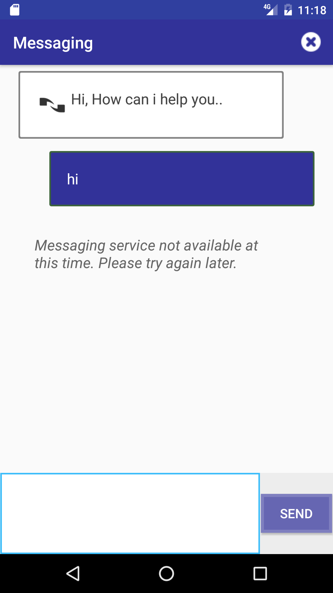
To replace the default agent icon. Add an image drawables having following name to your resource folder
agent_bubble_icon.png for Agent Speech bubble icon.
Arrow in Plain Bubble View in Converstation Screen
To display Arrow bubbles. Set the following property in your APP bools.xml resource file
| Name | type | default | example |
|---|---|---|---|
| useArrowInBubbles | bool | false | <bool name="useArrowInBubbles">true</bool> |
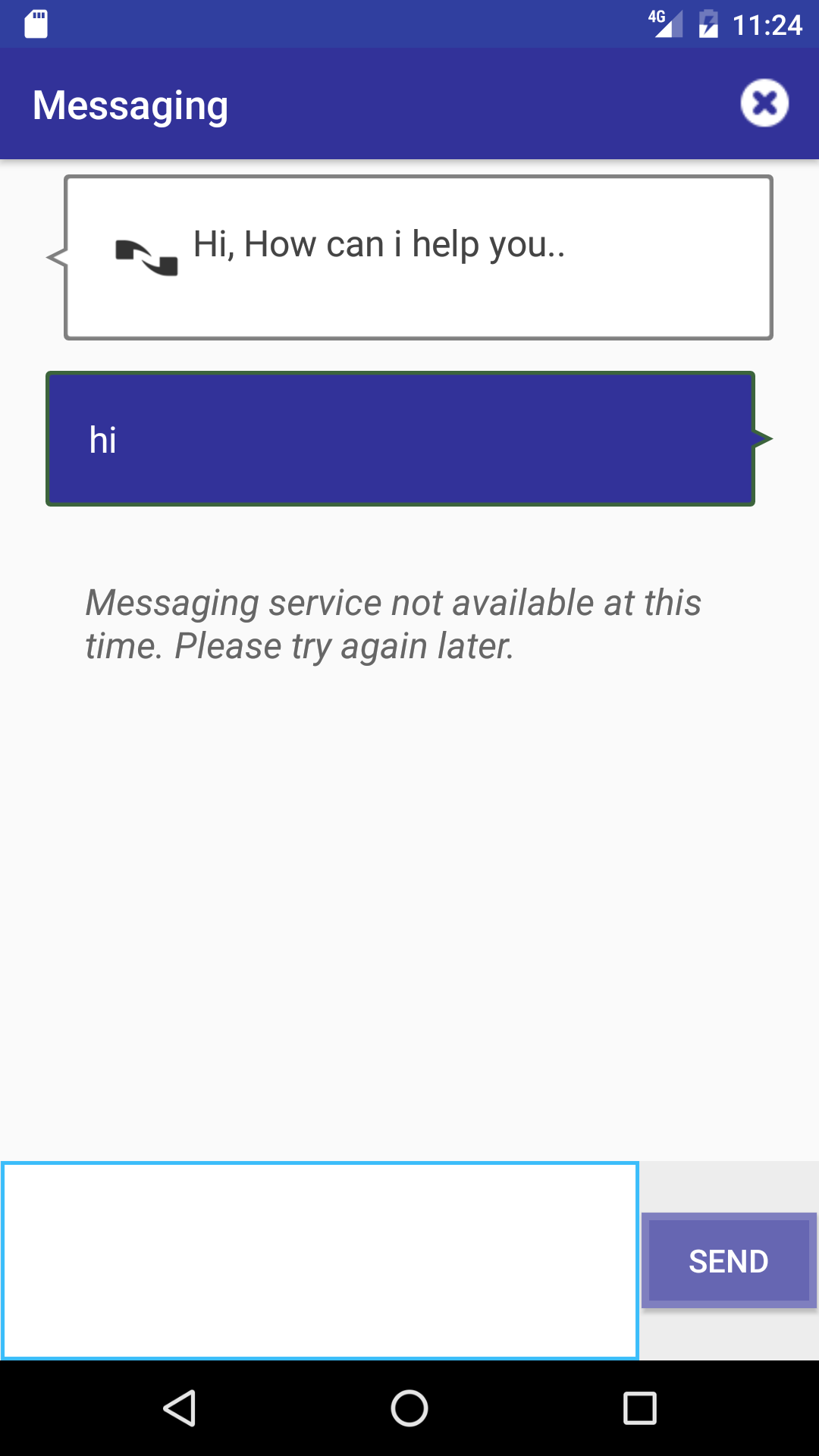
To replace the default agent icon. Add an image drawables having following name to your resource folder
agent_bubble_icon.png for Agent Speech bubble icon.
Speech Bubble View in Converstation Screen
To display Speech bubbles. Set the following property in your APP bools.xml resource file.
| Name | type | default | example |
|---|---|---|---|
| useSpeechChatLine | bool | false | <bool name="useSpeechChatLine">true</bool> |

To replace the default icon used in the Speech bubbles. Add two image drawables having following name to your resource folder
agentSpeechicon.png for Agent Speech bubble icon.
customerSpeechicon.png for Customer Speech bubble icon.
Styling Send Button
There are various properties for changing the look and feel of Send Button.
| Name | type | default | description |
|---|---|---|---|
| useFooterHeight | bool | false | 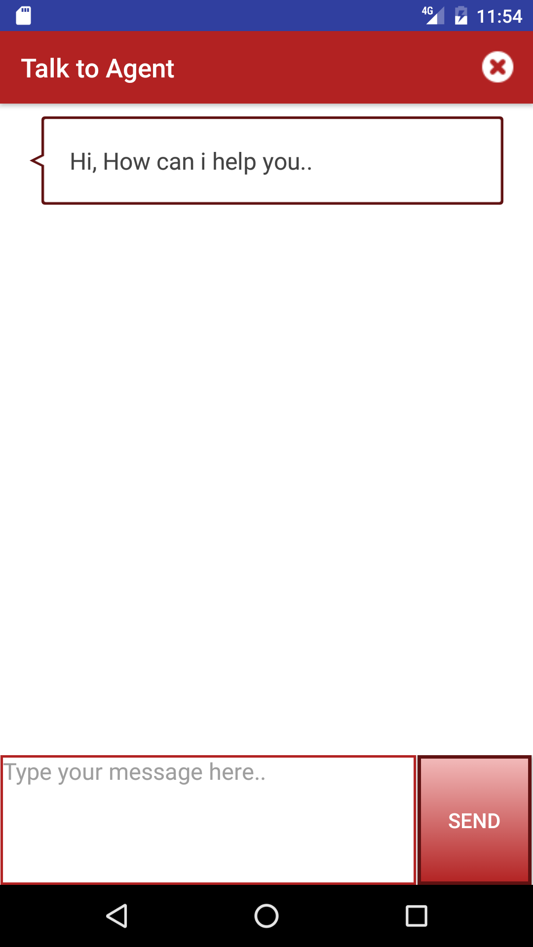
Setting this property to true make Send Button fill up whole footer height. <bool name="useFooterHeight">true</bool> |
| useGradientButton | bool | false | 
To set linear gradient color background. <bool name="useGradientButton">true</bool> |
| useArrowButton | bool | false | 
To display right Arrow send button. <bool name="useArrowButton">true</bool> |
| messagingSendTextColor | color | #FFFFFF | Change Send button Text color. |
| messagingSimpleBackground | color | #289728 | Change background color of Simple send button. |
| messagingArrowBackground | color | #289728 | Change background color of Arrow send button. |
| messagingSendBorderColor | color | #3bbdfa | Change border color of all button types. |
| messagingSendBorderSize | dimention | 3dp | Change border size of all button types. |
| messagingSendBorderRadius | dimention | 0dp | Change border color of Simple and Grandiant Button types. Cannot change border radius of Arrow Button. |
| messagingGradientStart | color | #75B900 | Grandiant button background start color. |
| messagingGradientEnd | color | #289728 | Grandiant button background end color. |
| messagingArrowColor | color | #FFFFFF | Set Arrow button arrow color. |
| messagingArrowPadding | dimention | 20dp | Adjust the padding size to set the width and height of Arrow in Arrow Send Button. |
| messagingSendText | string | Send | Change the send button text. |
| messagingSendTextSize | dimention | 16sp | Change the send button text size. |
| toggleSendStateAfterMsgSend | boolean | false | Set the send button to disabled state when Customer Text input contains 0 chars. Button will move to enabled state as soon as customer start typing. |
Styling Simple Send button using Background drawable:
SDK lets you set a drawable as the background of Messaging Simple Send button.
To set a background drawable, please add a drawable having the following name.
bg_simple_button.png or bg_simple_button.xml
Styling Send button using style resource:
In addition to the above properties , SDK also lets you customize send button by overriding the default Send button style.
			<style name="SimpleSendButtonDefault.SimpleSendButton">
				 <item name="android:padding">50dp</item>
			</style>


			<style name="SendContainerDefault.SendContainer">
			</style>
Configure Simple Send Button Disabled State
Application can configure to display a different background drawable when Simple send button is in disabled state.
When toggleSendStateAfterMsgSend boolean property is turned on, please add a drawable having the following name.
bg_simple_button_disabled.png or bg_simple_button_disabled.xml
Customer message input can also set a differnt background drawable when Input contains 0 characters (Send button is in disabled State).
When footer is diabled after a Messaging state error (agent left, network disconnect etc), please add a drawable having the following name.
bg_simple_button_error.png or bg_simple_button_error.xml
Styling CustomerTextInput
There are various properties for changing the look and feel of CustomerTextInput view.
| Name | type | default | description |
|---|---|---|---|
| customerInputBorderColor | color | #3bbdfa | Set the CustomerTextInput border color. |
| customerInputBackgroundColor | color | #ffffff | Set the CustomerTextInput background color. |
| customerInputBorderSize | dimention | 2dp | Set the CustomerTextInput border size. |
| customerInputBorderRadius | dimention | 0dp | Set the CustomerTextInput border radius. |
| sendMessageOnEnter | Boolean | true | Lets you control how SDK reacts when user press enter button. |
| limitCustomerInput | Boolean | false | Lets you control if the customer input should be limited in no of characters. |
Styling CustomerTextInput using style resource:
In addition to the above properties , SDK also lets you customize CustomerTextInput by overriding the default CustomerTextInput style.
<style name="CustomerInputDefault.CustomerTextInput">
	 <item name=""android:gravity">center</item>
</style>

<style name="MessagingInputContainerDefault.MessagingInputContainer"/>
</style>
Auto Growing Customer Input
Using the exposed Customer Input Style resources, application can configure the Customer Input to Grow and Shrink as user types
<style name="CustomerInputDefault.CustomerTextInput">
       <item name="android:layout_height">wrap_content</item>
       <item name="android:maxLines">4</item>
   </style>


  <style name="MessagingInputContainerDefault.MessagingInputContainer">
      <item name="android:layout_height">wrap_content</item>
  </style>
  <style name="MessagingFooterDefault.MessagingFooter">
      <item name="android:layout_height">wrap_content</item>
  </style>
Configure Customer Text Input Disabled State
Customer message input can also set a differnt background drawable when Input contains 0 characters (Send button is in disabled State).
When toggleSendStateAfterMsgSend boolean property is turned on, please add a drawable having the following name.
messaging_input_drawable_disabled.xml
Styling Plain or Arrow Bubble View
There are various properties for changing the look and feel of Plain or Arrow Bubble views.
| Name | type | default | description |
|---|---|---|---|
| agentBubbleBorderSize | dimention | 2dp | Set the border size of agent message bubble view. |
| agentBubbleTextSize | dimention | 20sp | Set the text size of agent message bubble view. |
| agentBubbleTextStyle | integer | 0 | Set the text style of agent message bubble view. Possible Values are
0 for NORMAL, 1 for BOLD, 2 for ITALIC and 3 for BOLD_ITALIC. This property does not work when use_2d_bubble_style set to false |
| agentBubbleBorderRadius | dimention | 5dp | Set the border radius of agent message bubble view. |
| customerBubbleBorderSize | dimention | 2dp | Set the border size of customer message bubble view. |
| customerBubbleTextSize | dimention | 20sp | Set the text size of customer message bubble view. |
| customerBubbleTextStyle | integer | 0 | Set the text style of agent message bubble view. Possible Values are
0 for NORMAL, 1 for BOLD, 2 for ITALIC and 3 for BOLD_ITALIC. This property does not work when use_2d_bubble_style set to false |
| customerBubbleBorderRadius | dimention | 5dp | Set the border radius of customer message bubble view. |
| typingBubbleBorderSize | dimention | 0dp | Set the border size of agent typing message bubble view. |
| typingBubbleBorderRadius | dimention | 5dp | Set the border radius of agent typing message bubble view. |
| typingBubbleTextStyle | integer | 0 | Set the text style of agent message bubble view. Possible Values are
0 for NORMAL, 1 for BOLD, 2 for ITALIC and 3 for BOLD_ITALIC. This property does not work when use_2d_bubble_style set to false |
| typingBubbleTextSize | dimention | 15sp | Set the text size of agent typing message bubble view. |
| systemBubbleBorderSize | dimention | 0dp | Set the border size of system message bubble view. |
| systemBubbleBorderRadius | dimention | 5dp | Set the border radius of system message bubble view. |
| systemBubbleTextStyle | integer | 2 | Set the text style of agent message bubble view. Possible Values are
0 for NORMAL, 1 for BOLD, 2 for ITALIC and 3 for BOLD_ITALIC. This property does not work when use_2d_bubble_style set to false |
| systemBubbleTextSize | dimention | 15sp | Set the text size of system message bubble view. |
| agentBubbleMarginLeft | dimention | 30dp | Agent Bubble margin Left. |
| agentBubbleMarginTop | dimention | 10dp | Agent Bubble margin Top. |
| agentBubbleMarginRight | dimention | 80dp for Plain Bubble and 30dp for Arrow Bubble | Agent Bubble margin Right. |
| agentBubbleMarginBottom | dimention | 10dp | Agent Bubble margin Bottom. |
| customerBubbleMarginLeft | dimention | 80dp for Plain Bubble and 30dp for Arrow Bubble | Customer Bubble margin Left. |
| customerBubbleMarginTop | dimention | 10dp | Customer Bubble margin Top. |
| customerBubbleMarginRight | dimention | 30dp | Customer Bubble margin Right. |
| customerBubbleMarginBottom | dimention | 10dp | Customer Bubble margin Bottom. |
| typingBubbleMarginLeft | dimention | 30dp | Typing Bubble margin Left. |
| typingBubbleMarginTop | dimention | 10dp | Typing Bubble margin Top. |
| typingBubbleMarginRight | dimention | 30dp | Typing Bubble margin Right. |
| typingBubbleMarginBottom | dimention | 10dp | Typing Bubble margin Bottom. |
| systemBubbleMarginLeft | dimention | 30dp | System Bubble margin Left. |
| systemBubbleMarginTop | dimention | 10dp | System Bubble margin Top. |
| systemBubbleMarginRight | dimention | 30dp | System Bubble margin Right. |
| systemBubbleMarginBottom | dimention | 10dp | System Bubble margin Bottom. |
| agentBubblePadding | dimention | 20dp | Set padding for agent Bubble view. |
| customerBubblePadding | dimention | 20dp | Set padding for customer Bubble view. |
| typingBubblePadding | dimention | 20dp | Set padding for typing Bubble view. |
| systemBubblePadding | dimention | 20dp | Set padding for system Bubble view. |
| agentBubbleBackground | color | #FFFFFF | Agent Bubble view background color. |
| customerBubbleBackground | color | #289728 | Customer Bubble view background color. |
| typingBubbleBackground | color | #0000 | Typing Bubble view background color. |
| systemBubbleBackground | color | #0000 | System Bubble view background color. |
| agentBubbleBorderColor | color | #808080 | Agent Bubble view border color. |
| customerBubbleBorderColor | color | #3c643c | Customer Bubble view border color. |
| typingBubbleBorderColor | color | #0000 | Typing Bubble view border color. |
| systemBubbleBorderColor | color | #0000 | System Bubble view border color. |
| agentBubbleTextColor | color | #FF444444 | Agent Bubble message Text color. |
| customerBubbleTextColor | color | #FFFFFF | Customer Bubble message Text color. |
| typingBubbleTextColor | color | #000000 | Typing Bubble message Text color. |
| systemBubbleTextColor | color | #666666 | System Bubble message Text color. |
| useIconInBubbles | bool | true | To hide and show icon in Bubble View. |
| showSystemMessageImage | bool | true | To hide and show System message icon. |
Styling Plain transcript bubble using Background drawable:
Simple and Arrow transcript bubble are by default rendered using 2D graphics. SDK allows you to change the default rendering method by changing the below property
| Name | type | default | example |
|---|---|---|---|
| use_2d_bubble_style | bool | true | <bool name="use_2d_bubble_style">false</bool> Setting this property will change the rendering method from 2D graphics to background drawable. |
Background drawable is made of an xml drawable file comprising the above style properties. So you can continue to use the above properties to sytle simple transcript bubble.
To change the default background drawable, please add a drawable having the following name.
bg_agent_chat_bubble.9.png or bg_agent_chat_bubble.xml
bg_customer_chat_bubble.9.png or bg_customer_chat_bubble.xml
bg_typing_chat_bubble.9.png or bg_typing_chat_bubble.xml
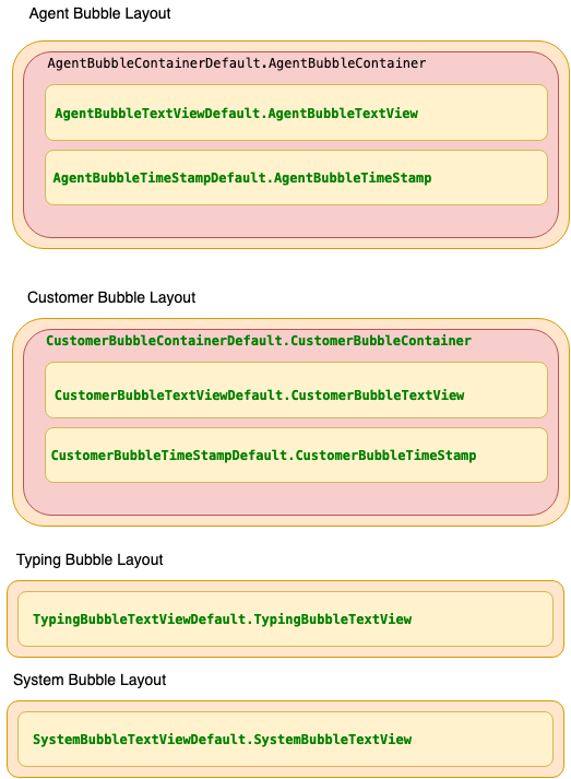
In addition to the style properties , SDK also lets you customize transcript bubbles by overriding the default style. This only allowed in background drawble mode not in 2D graphics mode.
			/** agent bubble container **/
			<style name="AgentBubbleContainerDefault.AgentBubbleContainer">

			</style>
			/** agent bubble text view where background drawable is added **/
			<style name="AgentBubbleTextViewDefault.AgentBubbleTextView">

			</style>

			/** customer bubble container **/
			<style name="CustomerBubbleContainerDefault.CustomerBubbleContainer">

			</style>
			/** customer bubble text view where background drawable is added **/
			<style name="CustomerBubbleTextViewDefault.CustomerBubbleTextView">

			</style>

			<style name="TypingBubbleTextViewDefault.TypingBubbleTextView">

			</style>

			<style name="SystemBubbleTextViewDefault.SystemBubbleTextView">

			</style>
Persisting System Messages in Transcript
By default System Messages disappear after a new Agent or Customer message appear. But certain Systems messages can be configured to persist in the transcript.
| Name | type | default | example |
|---|---|---|---|
| persistTransferStartMessage | bool | false | <bool name="persistTransferStartMessage">false</bool> Setting this property will make SDK to persist agent transfer start message in the transcript. |
| persistTransferConnectedMessage | bool | false | <bool name="persistTransferConnectedMessage">false</bool> Setting this property will make SDK to persist agent transfer connected message in the transcript. |
SDK internally uses transfer_start_message.xml and transfer_connected_message.xml layout file to render the above System messages when persist mode is turned on.
Application can override these layout files to customize the default UI displayed for those messages. Here is an example where a divider is displayed for transfer start System message.
Styling Speech Bubble View
There are various properties for changing the look and feel of Speech Bubble view.
| Name | type | default | description |
|---|---|---|---|
| agentSpeechBorderSize | dimention | 2dp | Set the border size of agent message Speech view. |
| agentSpeechTextSize | dimention | 15sp | Set the text size of agent message Speech view. |
| agentSpeechTextStyle | integer | 0 | Set the text style of agent message bubble view. Possible Values are
0 for NORMAL, 1 for BOLD, 2 for ITALIC and 3 for BOLD_ITALIC. This property does not work when use_2d_bubble_style set to false |
| agentSpeechBorderRadius | dimention | 12dp | Set the border radius of agent message Speech view. |
| customerSpeechBorderSize | dimention | 2dp | Set the border size of customer message Speech view. |
| customerSpeechTextSize | dimention | 15sp | Set the text size of customer message Speech view. |
| customerSpeechTextStyle | integer | 0 | Set the text style of agent message bubble view. Possible Values are
0 for NORMAL, 1 for BOLD, 2 for ITALIC and 3 for BOLD_ITALIC. This property does not work when use_2d_bubble_style set to false |
| customerSpeechBorderRadius | dimention | 12dp | Set the border radius of customer message Speech view. |
| typingSpeechBorderSize | dimention | 0dp | Set the border size of agent typing message Speech view. |
| typingSpeechTextSize | dimention | 15sp | Set the border radius of agent typing message Speech view. |
| typingSpeechTextStyle | integer | 0 | Set the text style of agent message bubble view. Possible Values are
0 for NORMAL, 1 for BOLD, 2 for ITALIC and 3 for BOLD_ITALIC. This property does not work when use_2d_bubble_style set to false |
| typingSpeechBorderRadius | dimention | 5dp | Set the text size of agent typing message Speech view. |
| systemSpeechBorderSize | dimention | 0dp | Set the border size of system message Speech view. |
| systemSpeechBorderRadius | dimention | 5dp | Set the text size of system message Speech view. |
| systemSpeechTextSize | dimention | 15sp | Set the border radius of system message Speech view. |
| systemSpeechTextStyle | integer | 2 | Set the text style of agent message bubble view. Possible Values are
0 for NORMAL, 1 for BOLD, 2 for ITALIC and 3 for BOLD_ITALIC. This property does not work when use_2d_bubble_style set to false |
| agentSpeechMarginLeft | dimention | 10dp | Agent Speech margin Left. |
| agentSpeechMarginTop | dimention | 0dp | Agent Speech margin Top. |
| agentSpeechMarginRight | dimention | 70dp | Agent Speech margin Right. |
| agentSpeechMarginBottom | dimention | 0dp | Agent Speech margin Bottom. |
| customerSpeechMarginLeft | dimention | 70dp | Customer Speech margin Left. |
| customerSpeechMarginTop | dimention | 0dp | Customer Speech margin Top. |
| customerSpeechMarginRight | dimention | 10dp | Customer Speech margin Right. |
| customerSpeechMarginBottom | dimention | 0dp | Customer Speech margin Bottom. |
| typingSpeechMarginLeft | dimention | 10dp | Typing Speech margin Left. |
| typingSpeechMarginTop | dimention | 0dp | Typing Speech margin Top. |
| typingSpeechMarginRight | dimention | 10dp | Typing Speech margin Right. |
| typingSpeechMarginBottom | dimention | 0dp | Typing Speech margin Bottom. |
| systemSpeechMarginLeft | dimention | 10dp | System Speech margin Left. |
| systemSpeechMarginTop | dimention | 0dp | System Speech margin Top. |
| systemSpeechMarginRight | dimention | 10dp | System Speech margin Right. |
| systemSpeechMarginBottom | dimention | 0dp | System Speech margin Bottom. |
| agentSpeechPadding | dimention | 20dp | Set padding for agent Speech view. |
| customerSpeechPadding | dimention | 0dp | Set padding for customer Speech view. |
| typingSpeechPadding | dimention | 0dp | Set padding for typing Speech view. |
| systemSpeechPadding | dimention | 20dp | Set padding for system Speech view. |
| agentIconBorderSize | dimention | 2dp | Set size of the border around Agent Speech icon. |
| customerIconBorderSize | dimention | 2dp | Set size of the border around Customer Speech icon. |
| agentSpeechBackground | color | #f2f0d7 | Agent Speech message background color. |
| customerSpeechBackground | color | #d5deed | Customer Speech mesasge background color. |
| typingSpeechBackground | color | #0000 | Typing Speech background color. |
| systemSpeechBackground | color | #0000 | System Speech message background color. |
| agentSpeechBorderColor | color | #82817c | Agent Speech message border color. |
| customerSpeechBorderColor | color | #162b4f | Customer Speech message border color. |
| typingSpeechBorderColor | color | #0000 | Typing Speech message border color. |
| systemSpeechBorderColor | color | #0000 | System Speech message border color. |
| agentSpeechTextColor | color | #FF444444 | Agent Speech message Text color. |
| customerSpeechTextColor | color | #000000 | Customer Speech message Text color. |
| typingSpeechTextColor | color | #000000 | Typing Speech message Text color. |
| systemSpeechTextColor | color | #666666 | System Speech message Text color. |
| agentIconBorderColor | color | #82817c | Set the color of the border around Agent Icon |
| customerIconBorderColor | color | #3bbdfa | Set the color of the border around Customer Icon |
Styling Speech transcript bubble using Background drawable:
Speech transcript bubble are by default rendered using 2D graphics. SDK allows you to change the default rendering method by changing the below property
| Name | type | default | example |
|---|---|---|---|
| use_2d_bubble_style | bool | true | <bool name="use_2d_bubble_style">false</bool> Setting this property will change the rendering method from 2D graphics to background drawable. |
Background drawable is made of an xml drawable file comprising style properties from Simple transcript bubble, Note that style properties metioned above is not used when rendering mode is changed to drawable based.
Simple transcript bubble style properties are instead used to style the message portion of speech transcript bubble.
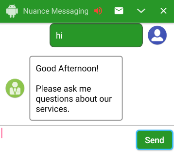
To change the default bubble background drawable, please add a drawable having the following name.
bg_agent_chat_bubble.9.png or bg_agent_chat_bubble.xml
bg_customer_chat_bubble.9.png or bg_customer_chat_bubble.xml
bg_typing_chat_bubble.9.png or bg_typing_chat_bubble.xml
To change the default icons, please add a drawable having the following name.
ic_agent_speech.png
ic_customer_speech.png
In addition to the Simple transcript view style properties, following are avilable to style the container holding both icon and message
| Name | type | default | example |
|---|---|---|---|
| agentSpeechMarginLeft | dimen | 10dp | |
| agentSpeechMarginRight | dimen | 70dp | |
| agentSpeechMarginTop | dimen | 0dp | |
| agentSpeechMarginBottom | dimen | 0dp | |
| customerSpeechMarginLeft | dimen | 70dp | |
| customerSpeechMarginRight | dimen | 10dp | |
| customerSpeechMarginTop | dimen | 0dp | |
| customerSpeechMarginBottom | dimen | 0dp | |
| groupMsgs | bool | false | Use this property to group agent and customer messages.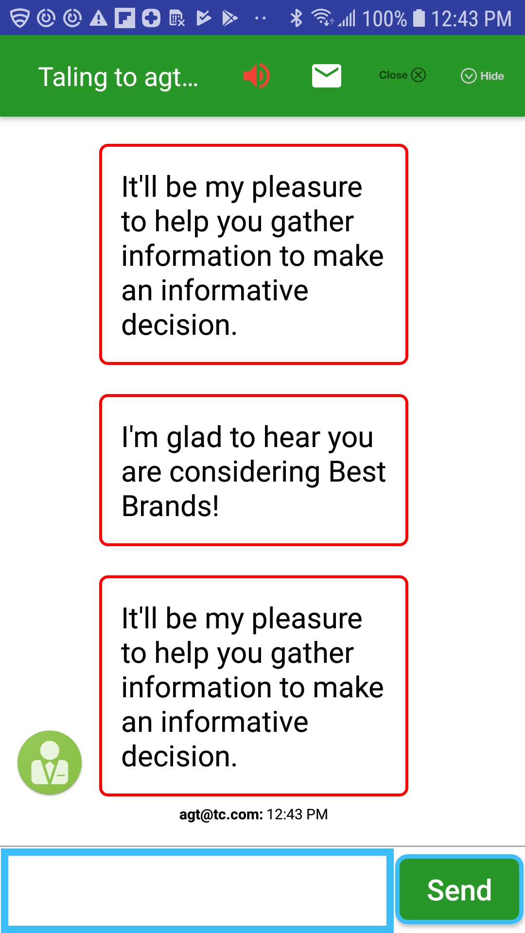 |
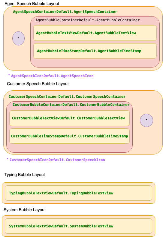
In addition to the style properties , SDK also lets you customize transcript bubbles by overriding the default style resource. This only allowed in background drawble mode not in 2D graphics mode.
			/** agent bubble container **/
			<style name="AgentBubbleContainerDefault.AgentBubbleContainer">

			</style>
			/** agent bubble text view where background drawable is added **/
			<style name="AgentBubbleTextViewDefault.AgentBubbleTextView">

			</style>

			/** customer bubble container **/
			<style name="CustomerBubbleContainerDefault.CustomerBubbleContainer">

			</style>
			/** customer bubble text view where background drawable is added **/
			<style name="CustomerBubbleTextViewDefault.CustomerBubbleTextView">

			</style>

			<style name="TypingBubbleTextViewDefault.TypingBubbleTextView">

			</style>

			<style name="SystemBubbleTextViewDefault.SystemBubbleTextView">

			</style>

			<style name="AgentSpeechContainerDefault.AgentSpeechContainer">

			</style>

			<style name="CustomerSpeechContainerDefault.CustomerSpeechContainer">

			</style>


			<style name="AgentSpeechIconDefault.AgentSpeechIcon">

			</style>

			<style name="CustomerSpeechIconDefault.CustomerSpeechIcon">

			</style>
Use the below style resource to customize Virtual agent message speech icon.
/** Below style resource inherits from AgentSpeechIconDefault.AgentSpeechIcon, Use this style in order to set different speech icon for VA responses**/
<style name="VirtualAgentSpeechIconDefault.AgentSpeechIcon">
	<item name="android:src">@drawable/ic_va_speech_icon</item>
</style>

/** To hide icon that is displayed as customer speech icon **/
<style name="CustomerSpeechIconDefault.CustomerSpeechIcon">
	<item name="android:src">@null</item>
</style>
Activity
There are various properties that can be set to Activity Layout.
| Name | type | default | description |
|---|---|---|---|
| messagingFooterHeight | dimention | 100dp | Set the height of Messaging Layout Footer where customer Input and Send button are childrens. |
| messagingFooterBackground | color | #ededed | Set the footer background color |
| messagingFooterTopBorderColor | color | #ededed | Set the footer top border color |
| messagingFooterTopBorderSize | dimen | 2dp | Set the footer top border size |
| messagingActivityBackground | color | #ffffff | You can set this property to change the activity background color. |
| messagingFragmentBackground | color | #ffffff | You can set this property to change the fragment background color. This property is used when you use NuanceMessagingFragment. |
| messagingTitleTextColor | color | #ffffff | Set the color of Messaging activity title. |
| messagingTitleBackground | color | #289728 | Set the background color of Messaging activity title. |
| messagingTitlePaddingLeft | dimen | 10dp | Set the Messaging Activity Title left padding. |
| messagingTitleSize | dimen | 10sp | Set the Messaging Activity Title text size. |
| messagingColorPrimaryDark | color | #303F9F | Set the Status bar color. |
| transcriptReverseFlow | bool | false | Display and render message from bottom and pushes up as new messages arrives.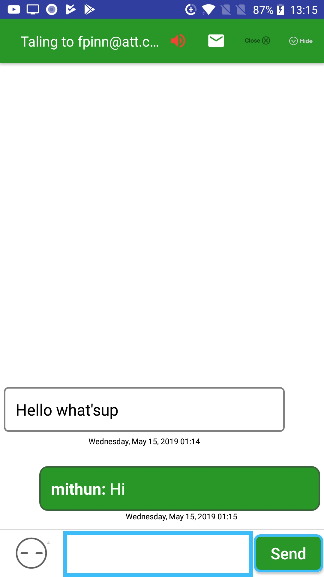 |
| showAgentStoppedMsg | bool | true | Use this property to control the display of agent stopped typing message. |
| slideUpDownActivtyAnim | bool | false | Use this property to display a slip up animation of messaging activity |
| forcePortrait | bool | false | Use this property to force the window to be in portrait mode |
| displayTransferStatusMessage | bool | true | Use this property to control the display of transfer status messages |
| displayTransferInitiateMessage | bool | true | Use this property to control the display of transfer initiated messages |
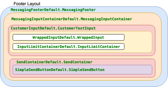
Styling Messaging Layout using style resource:
In addition to the above properties , SDK also lets you customize Activity layout by overriding the below style classes.
<style name="TranscriptContainerDefault.TranscriptContainer">
</style>

<style name="MessagingFooterDefault.MessagingFooter">
    <item name="android:layout_height">150dp</item>
</style>
Email Dialog Properties
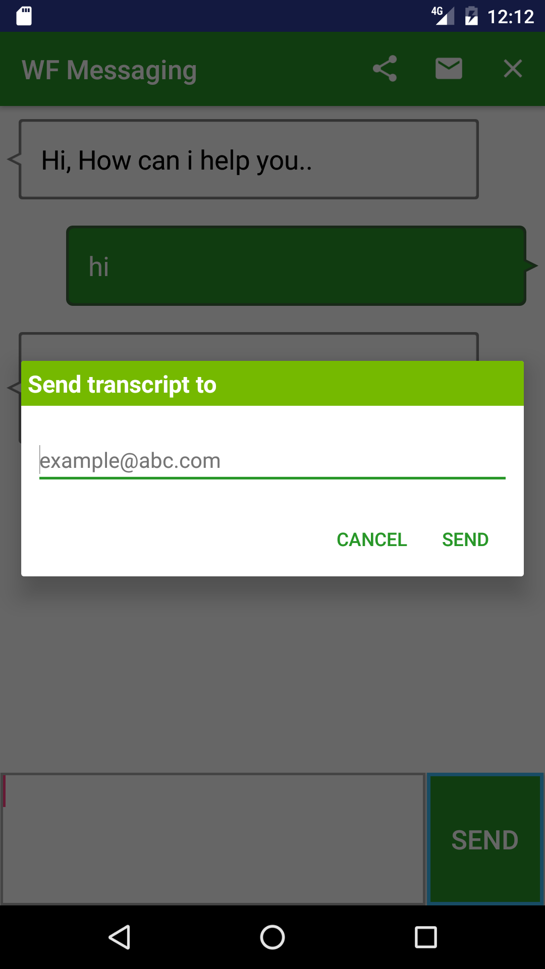

Use below propeties for customizing Email Dialog view.
| Name | type | default | description |
|---|---|---|---|
| dialog_email_title_text_size | dimention | 18sp | Set the email dialog title size. |
| dialog_email_txt_size | dimention | 16sp | Set the email address text size. |
| dialog_email_body_bg | color | #FFFFFF | Set the email dialog background color. |
| dialog_email_positive_button_text_color | color | #289728 | Set the email dialog Positive Button text color. |
| dialog_email_negative_button_text_color | color | #289728 | Set the email dialog Negative Button text color. |
| dialog_email_title_color | color | #FFFFFF | Set the email dialog title text color. |
| dialog_email_title_bg | color | #75B900 | Set the email dialog title background color. |
| dialog_email_title | string | Send transcript to | Set the email dialog title. |
| dialog_email_positive_button_text | string | Send | Set the email dialog Positive button text. |
| dialog_email_negative_button_text | string | Cancel | Set the email dialog Negative button text. |
| dialog_txt_email_hint | string | example@abc.com | Set the email address hint text. |
| dialog_email_body | string | Email body | Set the email dialog description. |
| dialog_txt_email_error | string | Email address not valid | Set the email dialog error text. |
| email_dialog_contacts_icon | boolean | false | Displays an icon for getting email from your contacts.  |
| no_email_address_for_contacts | string | No Email for Selected Contact | Set the text for error displayed when no email found for selected contact. |
| msg_read_contacts_permissions_error | string | Provide access to read email id from your contact | Set the text for when read contact permission is denied. |
| email_dialog_error_on_no_engagment | string | No active engagement found | Set the text for the toast displayed when no engagement is found. |
| email_success | string | Email successfully sent | Set the text for the toast displayed email api request is successfull. |
| email_failure | string | Failed to send Email | Set the text for the toast displayed email api request is failed. |
In addition to the above properties , SDK also lets you customize Email dialog by overriding the default styless.
	 <style name="EmailDialogContainerDefault.EmailDialogContainer"></style>

	 <tyle name="EmailDialogBodyDefault.EmailDialogBody"></style>

    <style name="EmailDialogTitleDefault.EmailDialogTitle"></style>

	<style name="EmailDialogContactIconDefault.EmailDialogContactIcon"></style>

	<style name="EmailDialogEditTextDefault.EmailDialogEditText"></style>

	 <style name="EmailDialogEmailValidationErrorDefault.EmailDialogEmailValidationError"></style>

    <style name="EmailDialogButtonContainerDefault.EmailDialogButtonContainer"></style>

    <style name="EmailDialogNegativeButtonDefault.EmailDialogNegativeButton"></style>

    <style name="EmailDialogPositiveButtonDefault.EmailDialogPositiveButton"></style>
Messaging App String Properties
Properties for changing various default strings messages used in the App.
| Name | type | default | description |
|---|---|---|---|
| messaging_title | string | Messaging | Sets the action bar title. |
| messaging_close_text | string | Close | Sets the text of action bar item for closing the messaging session. For this property to have an effect, you must set showCloseIcon boolean property to false. |
| messagingInputText | string | Type your message here.. | Set the hint text displayed in customer input view. |
| messagingOpenerText | string | Hi, How can i help you.. | Sets the agent opener text displayed in the converstation screen. |
| messagingNotAvailable | string | Messaging service not available at this time. Please try again later. | Sets the text which is displayed when messaging service is not available. |
| serviceQueued | string | An agent will respond as soon as they are available. | Sets the text which is displayed when engagement is queued. |
| agentNowAvailable | string | Agent now available. | Sets the text which is displayed when engagement goes from queue to assigned. |
| networkNotAvailable | string | Connection to messaging server is disconnected. Please check your network.. | Sets the text which is displayed when device network is lost during an active engagement. |
| networkAvailable | string | Connectiong to messaging server is restored. | Sets the text which is displayed when device network is restored. |
| agentNowLeft | string | Message that gets displayed when agent left the conversation. | |
| inActivity_TO_Text | string | Agent Left the conversation due to inActivity. | Message that gets displayed when connection to chatrouter is timed out. |
| agent_transfer | string | Message that gets displayed when agent gets transfered, for example Nina to Live agent. | |
| agent_transfer_connected | string | Message that gets displayed when transferred agent connected. | |
| agent_Lost | string | Message that gets displayed when agent got disconnected due to some reason. | |
| agent_Lost | string | Message that gets displayed when agent got disconnected due to some reason. | |
| msg_typing | string | Message that is displayed when agent is typing. | |
| msg_stopped_typing | string | Message that is displayed when agent has stopped typing. |
Customizing Title Bar
Close:
Close:
To replace the default close icon. Add an image drawables with following name to your resource folder
ic_action_close.png. Drawable must be added for all device resolution.
Close action bar menu item can be displayed as either button or as a popup option. By default it displays as button. To display as popup option,set the below boolean property to false.
| Name | type | default | example |
|---|---|---|---|
| showCloseIcon | bool | true | <bool name="showCloseIcon">false</bool> |
Email:
To replace the default Email icon. Add an image drawables with following name to your resource folder
ic_action_mail.png. Drawable must be added for all device resolution.
Use below property to set the visibility of Email button.
| Name | type | default | example |
|---|---|---|---|
| showEmailIcon | bool | true | <bool name="showEmailIcon">true</bool> |
Share:
To replace the default Share icon. Add an image drawables with following name to your resource folder
ic_action_share.png. Drawable must be added for all device resolution.
SDK is configured to display either Email or Share icon. If you need to display Share Icon instead of Email. Set the following boolean property to true
| Name | type | default | example |
|---|---|---|---|
| showShareIcon | bool | false | <bool name="showShareIcon">true</bool> |
Minimize:
To replace the default Minimize icon. Add an image drawables with following name to your resource folder
ic_action_minimize.png. Drawable must be added for all device resolution.
Use below property to set the visibility of Minimize button.
| Name | type | default | example |
|---|---|---|---|
| showMinimizeIcon | bool | true | <bool name="showMinimizeIcon">true</bool> |
Additionally, below property can be used to set the visibility of Minimize button programmatically.
NuanMessaging.getInstance().hideMinimizeMenuIcon(true/false);
Chime:
To replace the default Chime icon. Add an image drawables with following name to your resource folder
ic_stat_volume_off.png. Drawable must be added for all device resolution.
ic_stat_volume_up.png. Drawable must be added for all device resolution.
Use below property to set the visibility of chime button.
| Name | type | default | example |
|---|---|---|---|
| showChimeIcon | bool | true | <bool name="showChimeIcon">true</bool> |
Logo:
To display a logo image in the title bar, please set the below boolean property to true
| Name | type | default | example |
|---|---|---|---|
| showLogoInTitleBar | bool | false | <bool name="showLogoInTitleBar">true</bool> |
To replace the default logo image. Add an image drawables with following name to your resource folder
messaging_logo.png. Drawable must be added for all device resolution.
Title Image:
To display an image as title in the title bar, please set the below boolean property to true
| Name | type | default | example |
|---|---|---|---|
| showTitleImage | bool | false | <bool name="showTitleImage">true</bool> |
To replace the default title image. Add an image drawables with following name to your resource folder
ic_title_image.png. Drawable must be added for all device resolution.
In addition to the above properties ,You can also override the default styles used by the SDK.
<style name="ToolbarTitleDefault.ToolbarTitleDefault">
	 <item name=""android:gravity">center</item>
</style>

//Use this style class to change the look and feel of messaging toolbar.
 <style name="MessagingToolbarDefault.MessagingToolbar"></style>
In addition to messaging_title string property, SDK allows you to set a multiline spannable text as title. Also application can use the below method to set the title runtime
public void updateNuanceMessagingTitle(String title)
NuanMessaging.getInstance().updateNuanceMessagingTitle("<big><b>HAVI</b></big> <small><small><i> Virtual assistant</i></small></small><br/><small>Visa grant 11803000000003</small>");
SDK allows applicaton to set the log runtime, use the below method
public void updateNuanceMessagingLogo(int id)
NuanMessaging.getInstance().updateNuanceMessagingLogo(R.drawable.test_icon);
Customizing SDK Menu.xml
SDK has two Menu xml files. One for the items displayed right of the Messaging Title (menu_messaging.xml) and other for the one displayed Left of the title (menu_messaging_left.xml). Application can override this files to change positioning and visibility of Minimize and close title bar menu items
	 //menu_messaging.xml
				<?xml version="1.0" encoding="utf-8"?>
<menu xmlns:android="http://schemas.android.com/apk/res/android"
    xmlns:app="http://schemas.android.com/apk/res-auto">

	<item
        android:id="@+id/action_minimize"
        android:icon="@drawable/ic_action_minimize"
        android:orderInCategory="4"
        android:title="@string/messaging_minimize_text"
        app:showAsAction="always"
        android:visible="false"/>
    <item
        android:id="@+id/action_close"
        android:icon="@drawable/ic_action_close"
        android:orderInCategory="5"
        android:title="@string/messaging_close_text"
        app:showAsAction="always"
      />


//menu_messaging_left.xml

<?xml version="1.0" encoding="utf-8"?>
<menu xmlns:android="http://schemas.android.com/apk/res/android"
    xmlns:app="http://schemas.android.com/apk/res-auto">
Agent Message When Minimized
SDK continue to pull Agent Message even after the Messaging window is minimized.
To receive agent message when Messaging Window is minimzed ,SDK provides a method in NuanMessaging class to register listener
public void setMessageOnMinimizedListener(OnSuccessListener
		NuanMessaging.getInstance().setMessageOnMinimizedListener(new OnSuccessListener() {
                    @Override
                    public void onResponse(GetMessageResponse response) {
                        if (response.getMessageType().equals(MessageTypes.TYPE_CHATLINE))

                            System.out.println(response.getMessageType());
                    }
                });
Displaying Customer & Agent name in bubbles or Timestamp.
To display customer and agent name in the bubbles, please set displayNameInBubbles boolean property.
| Name | type | default | example |
|---|---|---|---|
| displayNameInBubbles | bool | false | <bool name="showCloseIcon">true</bool> |
| defaultCustomerName | string | me | Use this property to set the default Customer name. |
| showNameInTS | bool | false | use this property to display name in timestamp view |
Displaying Progress Dialog.
You can choose to display a progress dialog when previous conversation is retrieved. Usually this happens when NuanceMessagingActivity is restored from minimized state.
| Name | type | default | example |
|---|---|---|---|
| showSpinnerInRestore | bool | false | <bool name="showSpinnerInRestore">true</bool> |
| previousMessageDownloadText | string | Loading previous messages... | Use this property to change the loading message text. |
Displaying Timestamp in transcript bubbles.
SDK allows you to display a timestamp along with the transcript bubbles. Following properties lets you style the time stamp.
This only works in conjuction with drawable based transcript bubble rendering, refer Styling Plain transcript bubble using Background drawable

| Name | type | default | example |
|---|---|---|---|
| showTimeStamp | bool | false | <bool name="showTimeStamp">true</bool> Setting this property to true will display time stamp along with transcript bubbles |
| timestampPadding | dimen | 5dp | Use this property to change the timestamp log padding. |
| agentBubbleTimeStampTextSize | dimen | 10sp | Use this property to change agent timestamp log text size. |
| customerBubbleTimeStampTextSize | dimen | 10sp | Use this property to change customer time stamp log text size. |
| agentBubbleTimeStampTextColor | color | #000000 | Use this property to change agent time stamp log text color. |
| alignBubbleTimeStamp | string | right | Use this property to change timestamp log gravity. |
| bubble_timestamp_format | string | EEEE, MMMM d, yyyy hh:mm | Use this property to change timestamp log format. |
In addition to the above properties , SDK also lets you customize timestamp log by overriding the default style.
<style name="AgentBubbleTimeStampDefault.AgentBubbleTimeStamp">
	 <item name=""android:gravity">center</item>
</style>

<style name="CustomerBubbleTimeStampDefault.CustomerBubbleTimeStamp">
	 <item name=""android:gravity">center</item>
</style>
Displaying Backpress Confirmation.
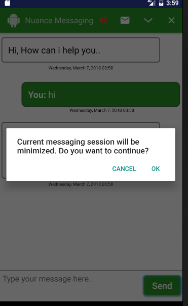
SDK lets you display a backpress confirmation dialog when user presses back button.
| Name | type | default | example |
|---|---|---|---|
| showBackPressConfirmation | bool | false | <bool name="showBackPressConfirmation">true</bool> Setting this property to true will display a confirmation dialog |
| back_press_confirmation_msg | string | Current messaging session will be minimized. Do you want to continue? | Use this property to change the confirmation dialog text |
| back_press_dialog_positive_button_text | string | Ok | Use this property to change the positive button text |
| back_press_dialog_negative_button_text | string | Cancel | Use this property to change the negative button text |
Displaying PostChat Confirmation Dialog.
SDK lets you display a Confirmation Dialog for launching post chat survey.
| Name | type | default | example |
|---|---|---|---|
| showPostChatDialog | bool | false | <bool name="showPostChatDialog">true</bool> Setting this property to true will display a confirmation dialog |
| dlg_chat_close_positive | string | dlg_chat_close_positive | Use this property to change the confirmation dialog postive button text. |
| dlg_chat_close_neagtive | string | cancel | Use this property to change the negative button text |
| dlg_chat_close_title | string | Use this property to set the dialog title | |
| dlg_chat_close_message | string | Use this property to set the dialog message |
<style name="NuanceAlertDialogTheme.AlertDialogTheme"/>
Styling File Upload fragment.
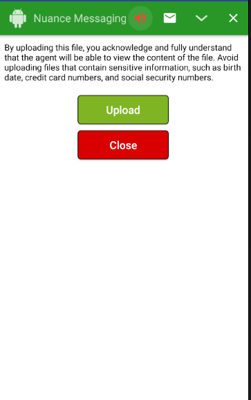
SDK comes with a fragment which lets customer to upload a file for agent to view. This will be displayed only when agent pushes the script to Application
| Name | type | default | example |
|---|---|---|---|
| fileUploadSelectBackgroundColor | color | #7FB523 | Lets you change the select button background color |
| fileUploadSelectBorderColor | color | #000000 | Lets you change the select button border color |
| fileUploadCloseBackgroundColor | color | #D90000 | Lets you change the close button background color |
| fileUploadCloseBorderColor | color | #000000 | Lets you change close button borde color |
| fileUploadMessageTextColor | color | #228B22 | Lets you change file upload status message text color |
| fileUploadCloseButtonBorderSize | dimen | 1dp | Lets you change file upload close button border size |
| fileUploadCloseButtonBorderRadius | dimen | 5dp | Lets you change file upload close button border radius |
| fileUploadSelectButtonBorderSize | dimen | 1dp | Lets you change file upload select button border size |
| fileUploadSelectButtonBorderRadius | dimen | 5dp | Lets you change file upload select button border radius |
| fileUploadSelectButtonWidth | dimen | 150dp | Lets you change file upload select button width |
| fileUploadSelectButtonPaddingLeft | dimen | 40dp | Lets you change file upload select button padding left |
| fileUploadSelectButtonPaddingRight | dimen | 40dp | Lets you change file upload select button padding right |
| fileUploadSelectButtonTextSize | dimen | 18sp | Lets you change file upload select button text size |
| fileUploadCloseButtonWidth | dimen | 150dp | Lets you change file upload close button width |
| fileUploadCloseButtonMarginTop | dimen | 10dp | Lets you change file upload close button margin top |
| fileUploadCloseButtonPaddingLeft | dimen | 401dp | Lets you change file upload close button padding left |
| fileUploadCloseButtonPaddingRight | dimen | 40dp | Lets you change file upload close button padding right |
| fileUploadMessagePadding | dimen | 10dp | Lets you change file upload status message text padding |
| fileUploadDisclaimerMarginBottom | dimen | 10dp | Lets you change file upload disclaimer text margin bottom |
| fileUploadDisclaimerPadding | dimen | 10dp | Lets you change file upload disclaimer text padding |
| max_file_upload_size | integer | 5242880 | Lets you change max file size in bytes |
| btn_file_upload_select_text | string | Upload | Lets you change file upload select button text |
| file_upload_disclaimer_text | string | By uploading this file... | Lets you change disclaimer text |
| btn_file_upload_close_text | string | Close | Lets you change file upload close button text |
| msg_file_type_not_allowed | string | File type not allowed to upload | Lets you change error message displayed when the uploaded file is not accepted. |
| msg_file_too_large | string | File is too large. Please select a file that is less than | Lets you change error message displayed when the uploaded file is over the limit |
| file_upload_error_text | string | Failed to upload file | Lets you change the error message displayed when there is server error. |
| file_upload_success_text | string | File successfully uploaded | Lets you change the message displayed when file uploaded successfully. |
In addition to the above properties , SDK also lets you customize file upload fragment by overriding the default style.
<style name="FileUploadedMessageDefault.FileUploadMessage">

</style>

<style name="UploadCloseButtonDefault.UploadCloseButton">
	 <item name=""android:gravity">center</item>
</style>
<style name="FileUploadedMessageDefault.FileUploadMessage">

</style>

<style name="UploadSelectButtonDefault.UploadSelectButton">
</style>
<style name="FileUploadDisclaimerDefault.FileUploadDisclaimer">
</style>
Displaying User Input Limit Counter
SDK has a feature which let application to display a character limit counter when responding to virtual agent
| Name | type | default | example |
|---|---|---|---|
| limitVAChars | bool | false | use this property to turn on the feature. |
| vaCounterDisplayThreshold | integer | 0 | Lets you configure at what point character limit should display. |
| inputCharLimt | integer | 120 | Lets you set the maximum character that is allowed to enter. |
In addition to the above properties , SDK also lets you customize Link preview by overriding the default style.
<style name="InputLimitTextView.InputTextTextView"></style>

<style name="InputLimitContainerDefault.InputLimitContainer"></style>
Content hugging
Below example style shows how to enable content hugging
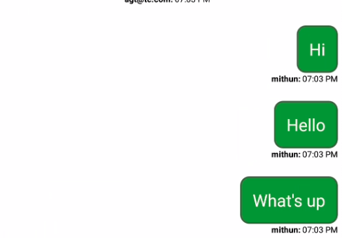
<style name="CustomerBubbleTextViewDefault.CustomerBubbleTextView">
    <item name="android:layout_width">wrap_content</item>
    <item name="android:gravity">right</item>
</style>

<style name="CustomerBubbleContainerDefault.CustomerBubbleContainer">
    <item name="android:layout_width">wrap_content</item>
    <item name="android:layout_alignParentRight">true</item>
</style>

<style name="CustomerBubbleTimeStampDefault.CustomerBubbleTimeStamp">
    <item name="android:layout_width">wrap_content</item>
    <item name="android:gravity">right</item>
</style>
Displaying Disclaimer Header
Disclaimer text appears at the top of the chat window immediately after messaging window is displayed.
| Name | type | default | example |
|---|---|---|---|
| disclaimer_text | string | Disclaimer text that is displayed on top of transcript area. |
|
| showDisclaimerHeader | bool | false | Configure SDK to display a disclaimer header. |
| autoHideDisclaimerHeader | bool | false | Configure SDK to hide the disclaimer after engagement is created. |
| autoHideHeaderTime | int | 3000ms | Configure SDK auto hide time in milliseconds for disclaimer text. This will be applicable only if autoHideDisclaimerText is set as true, the default value is 3000 milliSeconds. |
 	<style name="DisclaimerContainerDefault.DisclaimerContainer"/>
    <style name="DisclaimerHeaderDefault.disclaimerHeader"/>
Link Preview
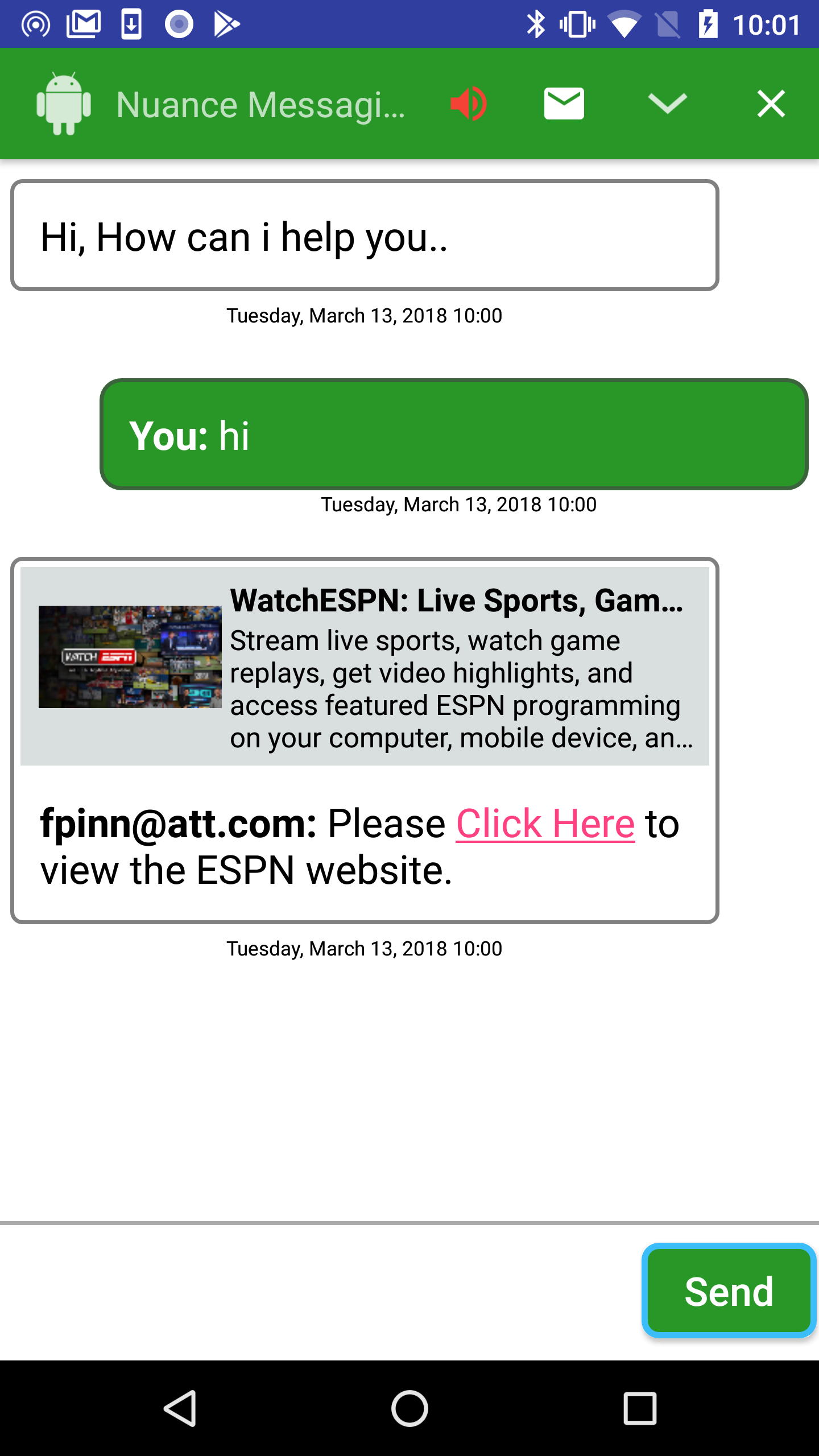
SDK comes with a Link Preview UI component, NuanceMessagingActivity can be configured to display a preview for all the Links pushed by agents.
| Name | type | default | example |
|---|---|---|---|
| showUrlLookup | bool | false | Setting this property to true will enable Link Preview. |
| urlPreviewDescriptionTextColor | color | #000000 | Lets you set the preview description text color. |
| urlPreviewTitleTextColor | color | #000000 | Lets you set the preview Title text color. |
| UrlPreviewIconWidth | dimen | 100dp | Lets you set the preview icon width. |
| UrlPreviewIconHeight | dimen | 80dp | Lets you set the preview icon height. |
| UrlPreviewIconPaddingLeft | dimen | 4dp | Lets you set the preview icon padding left. |
| UrlPreviewIconPaddingRight | dimen | 4dp | Lets you set the preview icon padding right. |
| UrlPreviewIconPaddingTop | dimen | 4dp | Lets you set the preview icon padding top. |
| UrlPreviewIconPaddingBottom | dimen | 4dp | Lets you set the preview icon padding bottom. |
| UrlPreviewTitleTextSize | dimen | 16sp | Lets you set the preview title text size. |
| UrlPreviewDescriptionTextSize | dimen | 14sp | Lets you set the preview description text size. |
| UrlPreviewTitleMaxLines | integer | 1 | Lets you configure the no of lines used by the title text. |
| UrlPreviewDescriptionMaxLines | integer | 4 | Lets you configure the no of lines used by the description text. |
In addition to the above properties , SDK also lets you customize Link preview by overriding the default style.
<style name="AgentBubbleContainerDefault.AgentBubbleContainerUrl"></style>

<style name="UrlPreviewContainerDefault.UrlPreview">
</style>

<style name="UrlPreviewIconDefault.UrlPreviewIcon">

</style>

<style name="UrlPreviewTitleDefault.UrlLookupTitle">

</style>
<style name="UrlPreviewDescriptionDefault.UrlLookupDescription">

</style>


<style name="AgentBubbleTextViewDefault.URLPreview">
</style>
Configuring RTL View in Messaging Window.
To take advantage of RTL layout mirroring, simply make the following changes to your app:
Declare in your app manifest that your app supports RTL mirroring.
Specifically, add android:supportsRtl="true" to the
For enabling RTL View in messaging window, you may have to override left/right layout properies in the default styles with start and end
//Add below styles to your style.xml file
   <style name="AgentBubbleContainerDefault.AgentBubbleContainer">
            <item name="android:layout_marginStart">@dimen/agentBubbleMarginLeft</item>
            <item name="android:layout_marginEnd">@dimen/agentBubbleMarginRight</item>
        </style>
        <style name="AgentBubbleTextViewDefault.AgentBubbleTextView">
            <item name="android:gravity">start</item>
            <item name="android:textAlignment">gravity</item>
            <item name="android:textDirection">locale</item>
        </style>
        <style name="NinaNativeViewDefault.NinaNativeView">
            <item name="android:gravity">start</item>
            <item name="android:textAlignment">gravity</item>
            <item name="android:textDirection">locale</item>
        </style>
        <style name="CustomerBubbleContainerDefault.CustomerBubbleContainer">
            <item name="android:layout_marginStart">@dimen/customerBubbleMarginLeft</item>
            <item name="android:layout_marginEnd">@dimen/customerBubbleMarginRight</item>
        </style>
        <style name="CustomerBubbleTextViewDefault.CustomerBubbleTextView">
            <item name="android:gravity">start</item>
            <item name="android:textAlignment">gravity</item>
            <item name="android:textDirection">locale</item>
        </style>
        <style name="SystemBubbleTextViewDefault.SystemBubbleTextView">
            <item name="android:layout_marginStart">@dimen/systemBubbleMarginLeft</item>
            <item name="android:layout_marginEnd">@dimen/systemBubbleMarginRight</item>
        </style>
        <style name="TypingBubbleTextViewDefault.TypingBubbleTextView">
            <item name="android:layout_marginStart">@dimen/typingBubbleMarginLeft</item>
            <item name="android:layout_marginEnd">@dimen/typingBubbleMarginRight</item>
        </style>
        <style name="AgentBubbleTimeStampDefault.AgentBubbleTimeStamp">
            <item name="android:gravity">end</item>
        </style>

        <style name="CustomerBubbleTimeStampDefault.CustomerBubbleTimeStamp">
            <item name="android:paddingStart">@dimen/timestampPadding</item>
        </style>
        <style name="AgentSpeachContainerDefault.AgentSpeechContainer">
            <item name="android:layout_marginStart">@dimen/agentSpeechMarginLeft</item>
            <item name="android:layout_marginEnd">@dimen/agentSpeechMarginRight</item>
        </style>

        <style name="CustomerSpeachContainerDefault.CustomerSpeechContainer">
            <item name="android:layout_marginStart">@dimen/customerSpeechMarginLeft</item>
            <item name="android:layout_marginEnd">@dimen/customerSpeechMarginRight</item>
        </style>
        <style name="AgentSpeechIconDefault.AgentSpeechIcon">
            <item name="android:layout_alignParentStart">true</item>
        </style>
        <style name="CustomerSpeechIconDefault.CustomerSpeechIcon">
            <item name="android:layout_alignParentEnd">true</item>
        </style>
        <style name="EmailDialogEditTextDefault.EmailDialogEditText">
            <item name="android:layout_alignParentStart">true</item>
        </style>
        <style name="TranslatorContainerDefault.TranslatorContainer">
            <item name="android:layout_alignParentStart">true</item>
        </style>
		<style name="MessagingInputContainerDefault.MessagingInputContainer" >
			<item name="android:layout_toEndOf">@+id/translator_container</item>
		</style>
		<style name="TranslatorProcessingContainerDefault.TranslatorProcessingContainer">
			<item name="android:layout_toEndOf">@+id/translator_container</item>
			<item name="android:paddingEnd">35dp</item>
		</style>
		<style name="EmailDialogNegativeButtonDefault.EmailDialogNegativeButton">
			<item name="android:gravity">start|center_vertical</item>

		</style>
		<style name="EmailDialogContactIconDefault.EmailDialogContactIcon">
			<item name="android:layout_alignParentEnd">true</item>
		</style>
	<?xml version="1.0" encoding="utf-8"?>
	<resources>
		<color name="colorPrimary">#3F51B5</color>
		<color name="colorPrimaryDark">#303F9F</color>
		<color name="colorAccent">#FF4081</color>
		<color name="messagingTitleBackground">#323299</color>
		<color name="messagingSimpleBackground">#6666b2</color>
		<color name="messagingSendBorderColor">#7f7fbf</color>
		<color name="customerBubbleBackground">#323299</color>

	</resources>
